You Have Never Seen a Black and White Photograph
If you have only ever looked at black and white photography on a screen you have not actually seen it yet.
Here is something worth sitting with. If you have spent your entire photographic life making and viewing black and white images on screens you have never actually seen a black and white photograph. You have seen a simulation of one. A backlit glowing approximation that shares some qualities with the real thing and differs from it in ways that matter more than most photographers realize.
This is not a complaint about digital photography. It is an observation about reference points. Every decision you make when editing a black and white image, how dark to push the blacks, where to let the highlights sit, how much contrast to add in the midtones, is shaped by your understanding of what a great black and white photograph looks like. If that understanding comes entirely from screens you are calibrating your eye against something that is fundamentally misrepresenting the medium you are working in.
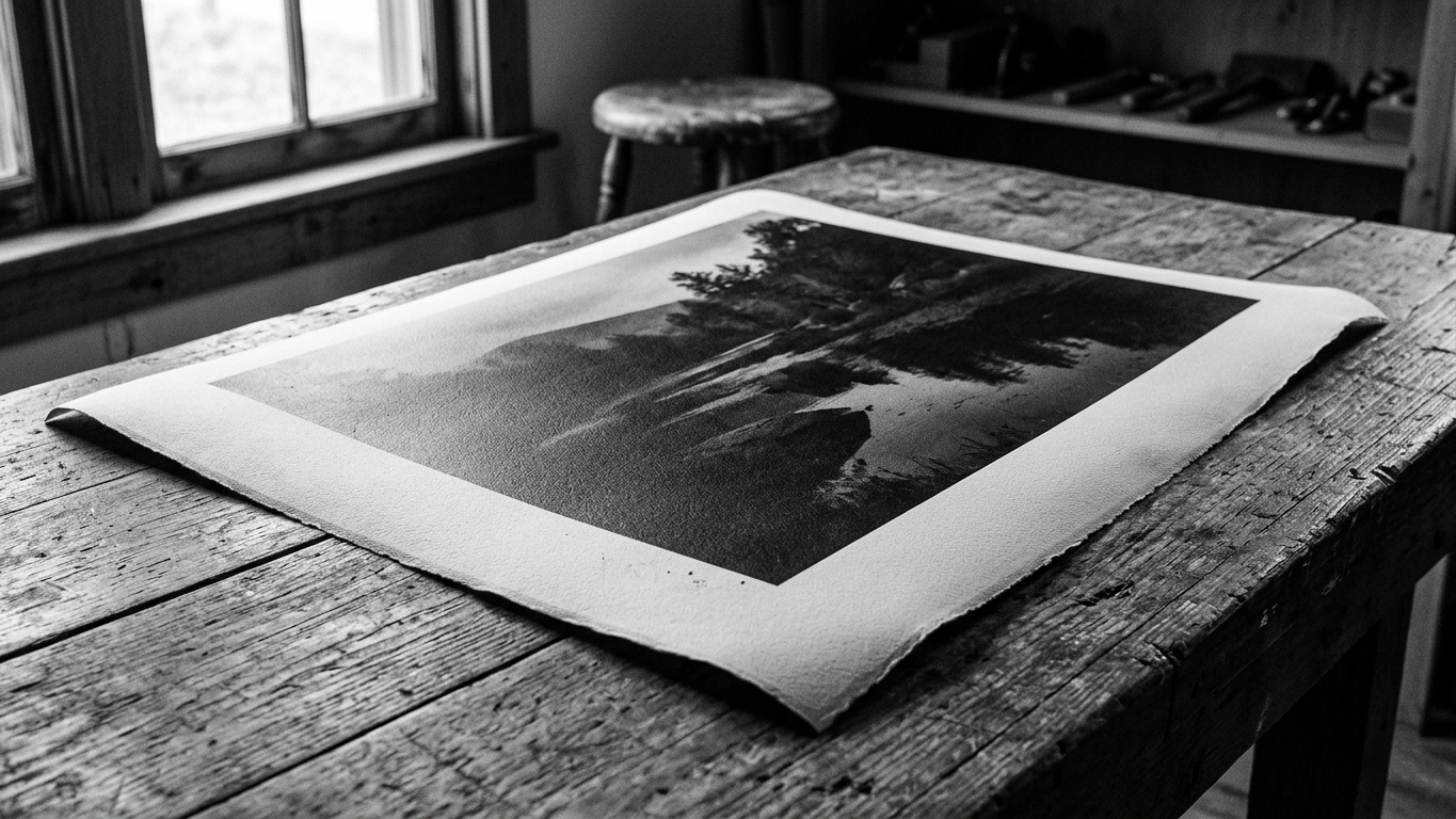
What a gelatin silver print actually is
Almost every black and white photograph made between roughly 1880 and the digital era was printed using the gelatin silver process. Silver halide crystals suspended in a gelatin layer coated onto paper. Exposed to light and developed chemically the silver halides reduce to metallic silver which forms the image. The tones you see in a gelatin silver print are literally silver. That is not a metaphor. The image is made of metal suspended in gelatin and that physical reality gives it a quality that no digital process has yet fully replicated.
The blacks in a fine gelatin silver print have a depth that is genuinely difficult to describe to someone who has not seen one. They do not just appear dark. They appear as if the paper has an interior and the darkness goes into it rather than sitting on the surface. The highlights have a luminosity that comes from reflected light rather than emitted light and that distinction changes the experience of looking fundamentally. The image does not glow at you. It waits for you to bring your attention to it. That is a completely different relationship between a photograph and a viewer than anything a screen produces.
What the masters understood that most of us do not
Ansel Adams did not develop the Zone System because he was obsessed with technical precision. He developed it because he needed a way to translate what he saw with his eyes in the landscape into what he could achieve on a gelatin silver print. The Zone System is a bridge between observation and the physical constraints of the printing process. It exists because Adams understood those constraints so deeply that he could visualize the final print before he pressed the shutter.
W. Eugene Smith spent more time in the darkroom than almost any other photojournalist of his era. He was known for printing sessions that lasted through the night, for dodging and burning by hand with pieces of card and wire tools, for refusing to release prints until the tonal relationships were exactly what he heard in his head when he looked at the negative. His understanding of what a great black looked like, what a luminous highlight looked like, what a midtone with genuine depth looked like, came from years of holding prints in his hands in natural light and knowing when the thing was right.
These photographers were not guessing. They had a physical reference for what they were aiming for and they worked toward it with complete clarity. Most of us are doing something genuinely harder. We are trying to make great black and white photographs without ever having held one.
The screen is lying to you
A screen emits light. A print reflects it. This is not a minor difference. When you look at a black and white image on a monitor the blacks you see are produced by the screen showing you as little light as possible. On a good monitor in a dark room that can look very convincing. But it is still light coming at you. When you look at a gelatin silver print the blacks are produced by a dense layer of metallic silver that absorbs almost all the light falling on it from the room. What your eye receives is the absence of reflection. That is a fundamentally different visual experience even if the two things look similar in a photograph of a photograph.
This matters for your editing because you are making decisions about your blacks, your highlights, your midtone contrast, by looking at light. But you are making photographs that most people will ultimately view as prints or at least as objects that exist in a different relationship with light than a screen does. Calibrating your eye only against screens is like tuning a musical instrument by listening to a recording of the instrument rather than the instrument itself. The recording might be very good but something essential is missing.
What to do about it
You do not need to build a darkroom. You do not need to start shooting film. What you need is to find a way to look at fine black and white prints in person and give them your full attention.
Museums and galleries are the most accessible option. Any major museum with a photography collection will have gelatin silver prints. Ask to see them if they are not on permanent display. Stand in front of them for longer than feels comfortable. Notice what the blacks actually look like. Notice the highlight separation, the way the very brightest areas still have texture and tonality rather than blowing out to pure white. Notice how the image sits in the paper rather than on top of it.
Photography books can also help, the right ones printed with care on the right paper. Books by or about Ansel Adams, Edward Weston, W. Eugene Smith, Dorothea Lange. The reproduction will not be a gelatin silver print but a well printed photobook on quality paper gets you closer to the real thing than any screen ever will.
And if you ever have the chance to see original prints in person at an auction house preview, a gallery show, or a museum exhibition, take it. Stand in front of a Weston pepper or an Adams landscape or a Smith portrait and let your eye recalibrate against something true. That experience will change how you edit for the rest of your life.
The reference point you are building toward
Every time you sit down to edit a black and white image you are trying to make something that feels complete. That has depth and presence and tonal integrity. That looks like it belongs in the tradition of the medium rather than like a color photograph with the color removed.
The photographers who built that tradition worked from a physical understanding of what the medium could do. They held the evidence in their hands. They knew what right looked like because they had seen it and made it and held it.
We are trying to get to the same place from a different direction. The screen is the tool we have and it is a good one. But the destination has not changed. A great black and white photograph is still the same thing it always was. We just have to work a little harder to know what we are aiming for.
Go find some prints. Look at them carefully. Then go back to your editing software and see if anything looks different.