What Actually Makes an Image Feel Three Dimensional
It has a real technical meaning, and it also gets used to justify a lot of expensive nonsense. Both things are true at once.
You have probably encountered the phrase 3D pop at some point, usually attached to a breathless claim about a specific lens, often an old, expensive one, supposedly rendering images with a mysterious three dimensional quality that modern glass cannot replicate. The real term underneath that marketing language is micro contrast, and it is worth understanding precisely, because it is both a genuine, definable phenomenon and one of the more overhyped and loosely used concepts in current photography discussion.
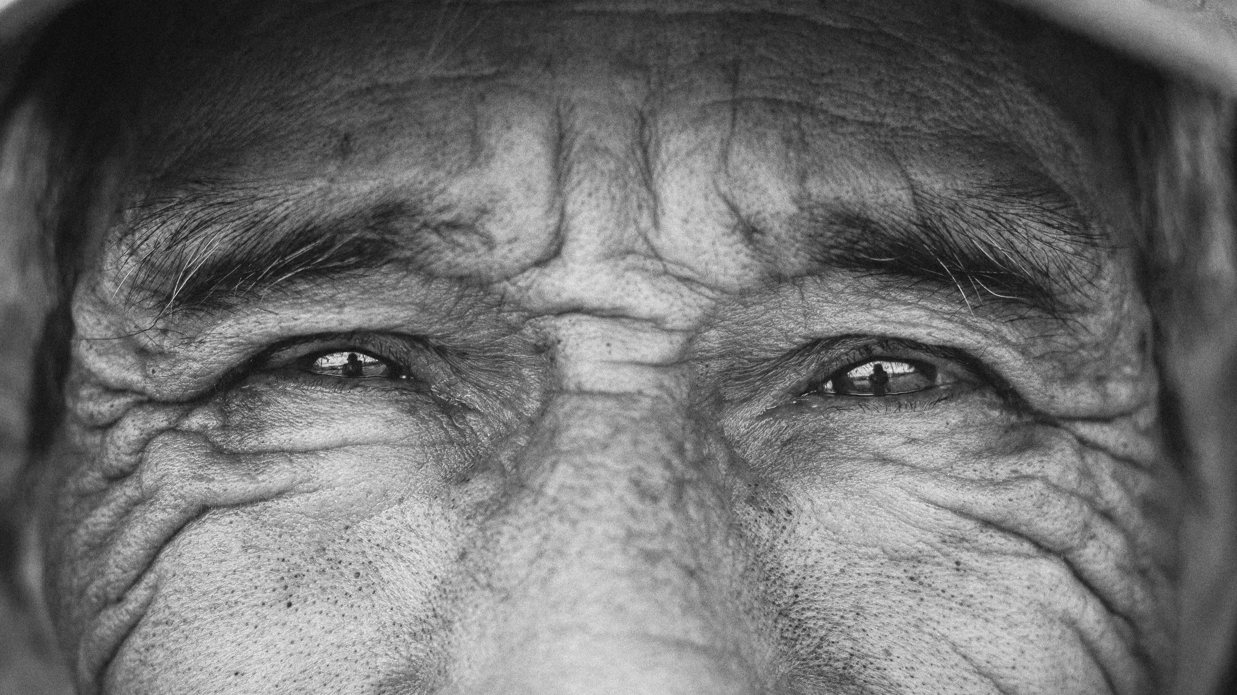
What it actually means
Contrast in a photograph operates at two different scales, and it is worth being precise about the difference. Global contrast is the broad tonal range across the whole image, the difference between the darkest shadow and the brightest highlight anywhere in the frame. Micro contrast is something else entirely, the tonal transitions happening at a very fine, local scale, the tiny gradations along an edge, a wrinkle, a strand of hair, the texture of stone or fabric.
An image with strong micro contrast preserves and even emphasizes those small local transitions, and the perceptual effect of that is a sense of depth and dimensionality, a subject seeming to separate from its background almost three dimensionally, even though the photograph is, of course, entirely flat. That perceptual effect is real. It is not simply marketing invention. It is what people are actually pointing at when they describe an image as having pop.
Why this matters more in black and white than in color
This is the part genuinely worth understanding for this community specifically. In color photography, a subject separates from its background through several different cues working together, tonal contrast, but also color separation, the simple fact that a red subject against a green background reads as distinct regardless of how similar their brightness levels are.
In black and white, that color separation is gone entirely. Tonal micro contrast is left doing significantly more of the dimensional work by itself, with no color cue to help it along. This is why black and white photographers tend to care about this quality more intensely, and more specifically, than color shooters generally do. It is not an aesthetic preference. It is a genuine structural difference in how the medium has to create the sense of depth at all.
What actually produces it, and the honest disagreement underneath the claims
Worth being direct about where real disagreement exists rather than pretending the science here is more settled than it actually is. Lens design plays a genuine role. Certain apochromatic and older, less digitally corrected optical designs render fine tonal transitions differently than modern lenses, which are frequently optimized primarily for edge to edge sharpness and minimal aberration rather than for tonal texture specifically. That is a real, physical difference in how light is being resolved.
How much of the commonly claimed 3D pop attributed to specific vintage or exotic lenses is genuinely explained by this, versus how much is closer to a subjective, somewhat mythologized quality attached to expensive glass without much rigorous evidence behind the specific claims, is genuinely disputed, and a fair treatment of this topic should say so plainly rather than repeating confident marketing language as settled fact.
What is not disputed is that local contrast adjustments in post processing, the clarity, texture, and structure sliders available in most editing software, are a direct and controllable way to add or reduce this quality deliberately, regardless of what lens originally captured the image. Subject matter matters too. A subject with a lot of fine texture, skin, fabric, stone, foliage, gives micro contrast real material to work with. A subject with smooth, largely textureless surfaces simply does not offer as much for this effect to act on, no matter how it was shot or processed.
The risk worth naming honestly
Overdone local contrast processing produces a recognizable, slightly harsh, artificial look, edges that develop faint halos, skin that starts to look etched rather than photographed. This is the same over-processed territory we have warned about in earlier posts on editing restraint. Micro contrast is a real and useful tool, but it is not an unqualified good to chase without limit. The same quality that gives a well handled black and white image genuine dimensional presence, pushed too far, starts to announce itself as processing rather than disappearing into the image the way strong editing should.
The honest bottom line
Micro contrast is a real, definable, and genuinely important concept for black and white photographers specifically, since it carries more of the dimensional load in monochrome than it does in color. It is also a term that has been stretched, mythologized, and attached to a fair amount of confident but unproven marketing language about specific lenses. Both of those things are true simultaneously, and understanding the actual mechanism, fine local tonal transitions rather than broad global contrast, is worth far more than chasing whichever piece of expensive glass is currently being credited with the mysterious pop everyone is talking about.