What Graphic Designers Know About Your Photographs That You Don't
Designers have to decide on purpose what the eye reads first, second, and third. Most photographers leave it to instinct, and it shows.
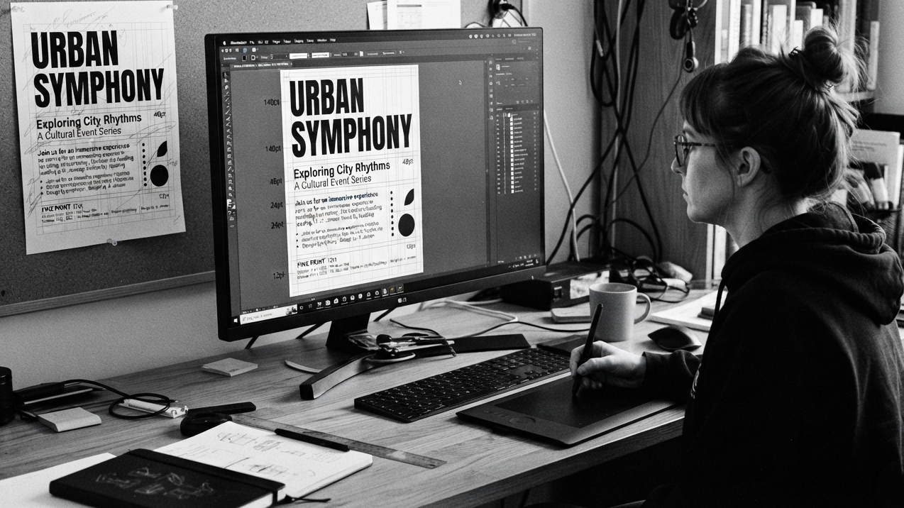
A graphic designer building a poster doesn't get to leave anything to chance. They decide, on purpose, what you read first. Then second. Then third. The headline is the biggest thing on the page because it's supposed to be the first thing you absorb. The subhead is smaller because it's supposed to come after. The fine print is smallest because it's the least urgent thing on the page, and if you never read it, the poster still did its job.
This isn't an accident of taste. It's a discipline. If a designer gets the hierarchy wrong, the failure is immediate and visible, the eye lands in the wrong place, the message doesn't land, the client notices.
Photographers almost never think this explicitly. We feel whether a composition "works" without being able to say exactly why, and when it doesn't work, we usually can't say exactly what went wrong either. Borrowing the designer's vocabulary directly, naming what's first, what's second, what's third, gives you a sharper and more teachable tool than vague instinct.
This is different from "give the eye somewhere to land"
We've written before about the importance of giving the viewer's eye a single clear destination, a runway to land on rather than an airport with no air traffic control. Hierarchy is related but it's not the same idea. Landing the eye somewhere is step one. Hierarchy is about everything that happens after that.
A photograph with a true hierarchy has a first read, a second read, and often a third. The eye doesn't land and stop. It's led through a sequence. This is the actual difference between a photograph that works once and a photograph that keeps giving you something on the second and third look. If there's only ever one destination and nothing planned beyond it, you look once and you're done. If there's a real hierarchy, primary subject, then a secondary element that rewards a longer look, then a small detail you only notice on the third pass, the image has a depth that a single point of focus alone can't produce.
How designers build hierarchy, and how it maps onto a photograph
Designers create hierarchy through four main tools, and all four translate directly.
Size. The biggest thing gets read first. In a photograph, "biggest" doesn't necessarily mean largest in the frame, it means the largest area of strong tonal contrast, or the largest unbroken shape against its surroundings. A small figure can still read as "the biggest thing" in the frame if it sits inside the largest area of contrast.
Contrast. The element that differs most from what's around it pulls the eye first. This is the one place where photographers and designers already speak nearly the same language, light against dark, sharp against soft, dense against empty.
Position. In Western reading culture, designers know the top-left of a layout tends to get scanned first. In photography, position relative to the frame's own structure, corners, the points where thirds intersect, the edge a subject is closest to, does similar work without most photographers naming it on purpose.
Isolation. In design, white space around an element makes it read as more important simply by giving it room to breathe. This is exactly the same instinct as negative space isolating a subject in a photograph. The space isn't empty. It's doing the work of making the thing inside it matter more.
The exercise worth trying
Pick one of your own images. Look at it and name out loud, actually say it, what you see first, second, and third.
If you can only name a first thing and nothing after it, the hierarchy probably stops there. That's not automatically a flaw, some images are meant to do one job and do it well, but it does mean the photograph isn't built to reward a longer look. If you find yourself naming two or three things that all feel equally important, equally loud, with no clear order between them, that's usually the actual reason an image feels busy or unresolved, even when every individual element in it is technically fine on its own. Competing first-place elements, not technical flaws, are behind most "almost right but not quite" photographs.
Why this matters more than it sounds like it should
Designers were forced to get explicit about this because their work fails immediately and visibly if they don't. A poster nobody can read in the right order doesn't sell anything. Photographers can get away with leaving the same decision to instinct, because a photograph doesn't fail quite as obviously, it just sits there feeling slightly unresolved, and most of us can't say exactly why.
That's the actual value in borrowing this from another discipline. Not that photography and design are similar in some general sense, but that designers solved a problem on purpose that photographers usually solve, or fail to solve, by accident. Naming the hierarchy in your own work, deliberately, the way a designer would, turns a feeling you can't quite explain into something you can actually see and fix.