Time Magazines top 100 photos of 2025 How many are Monochrome?
Every year, TIME Magazine releases its list of the Top 100 Photos That Defined the Year. It's the visual capstone of the calendar a reminder of the chaos, the quiet moments, and the seismic events that shifted the world.
The 2025 list is powerful, raw, and full of the essential human element that TIME’s photo editors (who spend months whittling down thousands of images) always champion.
But as I scrolled through, one number hit me like a splash of cold water: Only 5 of the 100 photographs were rendered in black and white.
Five percent.
What does that tiny fraction tell us about the state of photography? And more importantly, what does it tell us about how the world sees our craft?
The History of The 100
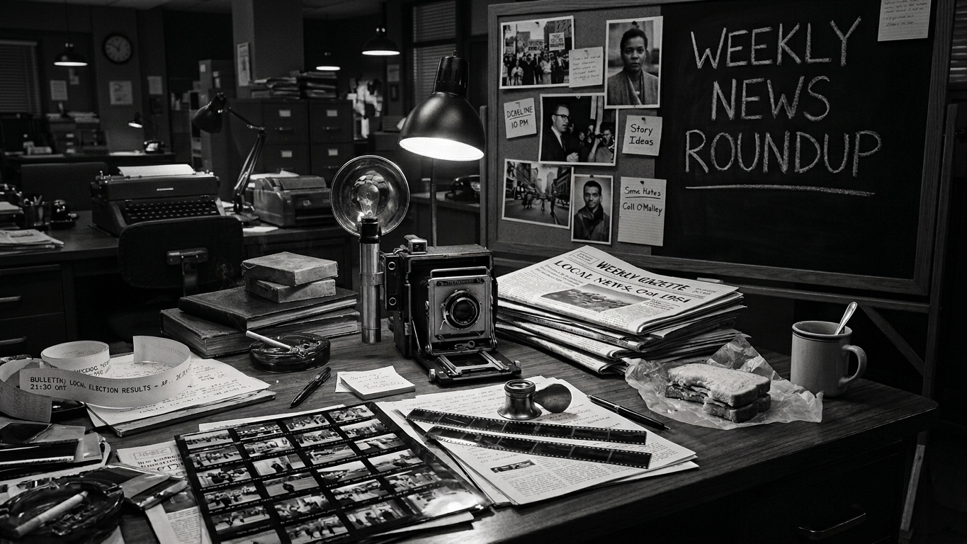
TIME has always understood the power of a defining image. Since the yearly roundup began, it’s never been about "pretty" pictures; it’s about impact. It’s about the photo that makes you stop, read the caption, and understand the news story on a visceral level.
The selection process, overseen by a team of photo directors, favors images with:
Emotional Impact: Raw human emotion is always a key ingredient.
Narrative Clarity: The image must clearly tell a piece of the year's story.
Graphic Strength: Strong composition and visual tension, often chaotic and loud.
Historically, black and white dominated this list because, for decades, it was the only language of photojournalism. But in 2025, with only 5 out of 100, monochrome is clearly the exception, not the rule.
When Color Is the Truth
In hard hitting photojournalism, especially concerning events like the tragedies in Gaza or the political unrest across Europe, color now serves as the primary witness.
When the goal is to document reality as unequivocally as possible, color adds a layer of factual evidence that the editors likely feel is essential. The vivid red of a protester’s banner, the ochre dust of a collapsed building, the fluorescent lighting of a detention center these specific details ground the image firmly in the contemporary, unfiltered truth.
When only 5% of the year's defining images are monochrome, it suggests that B&W is being reserved for two specific uses:
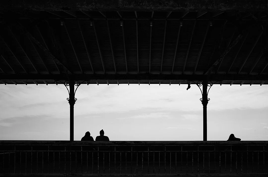
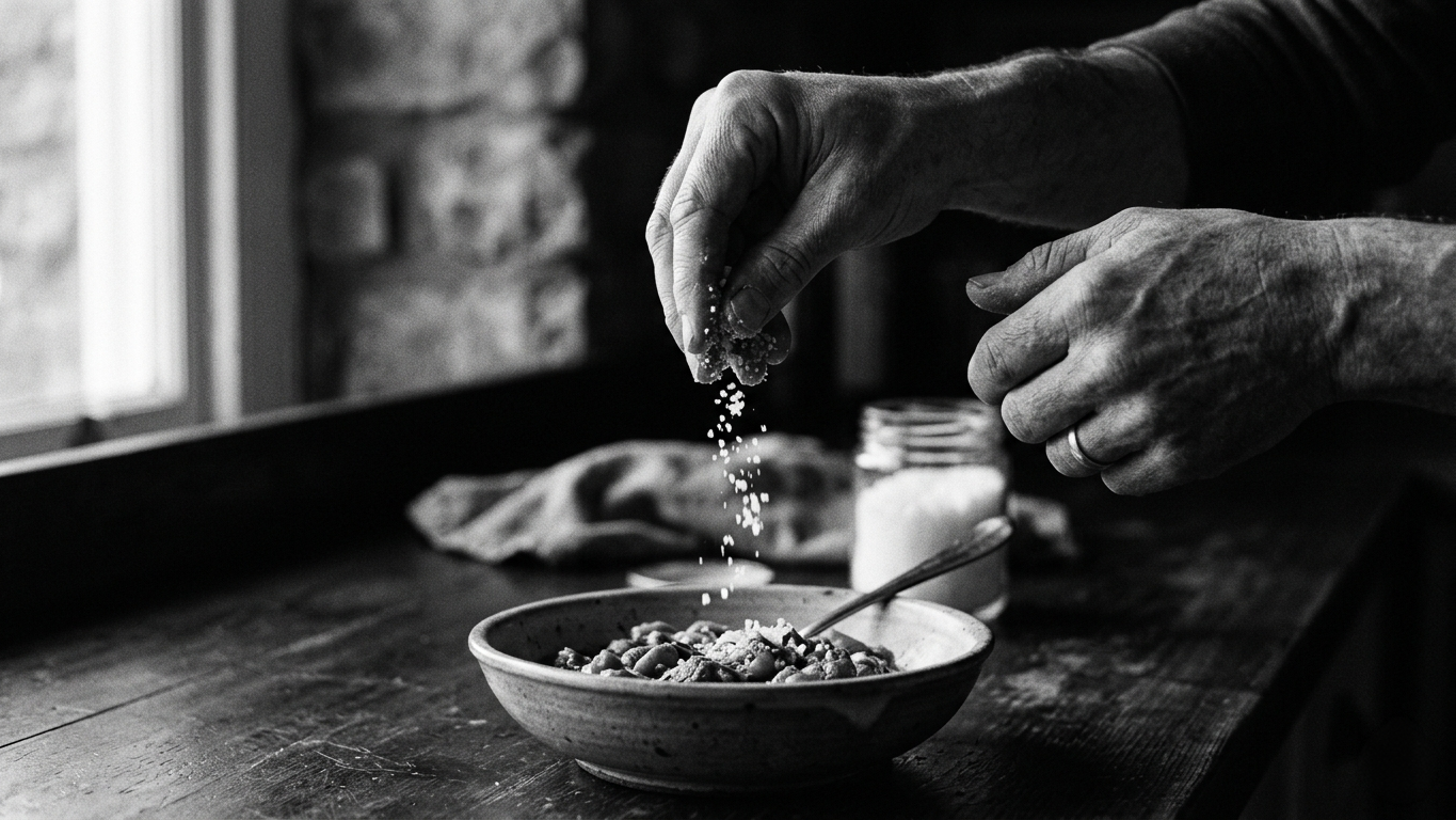
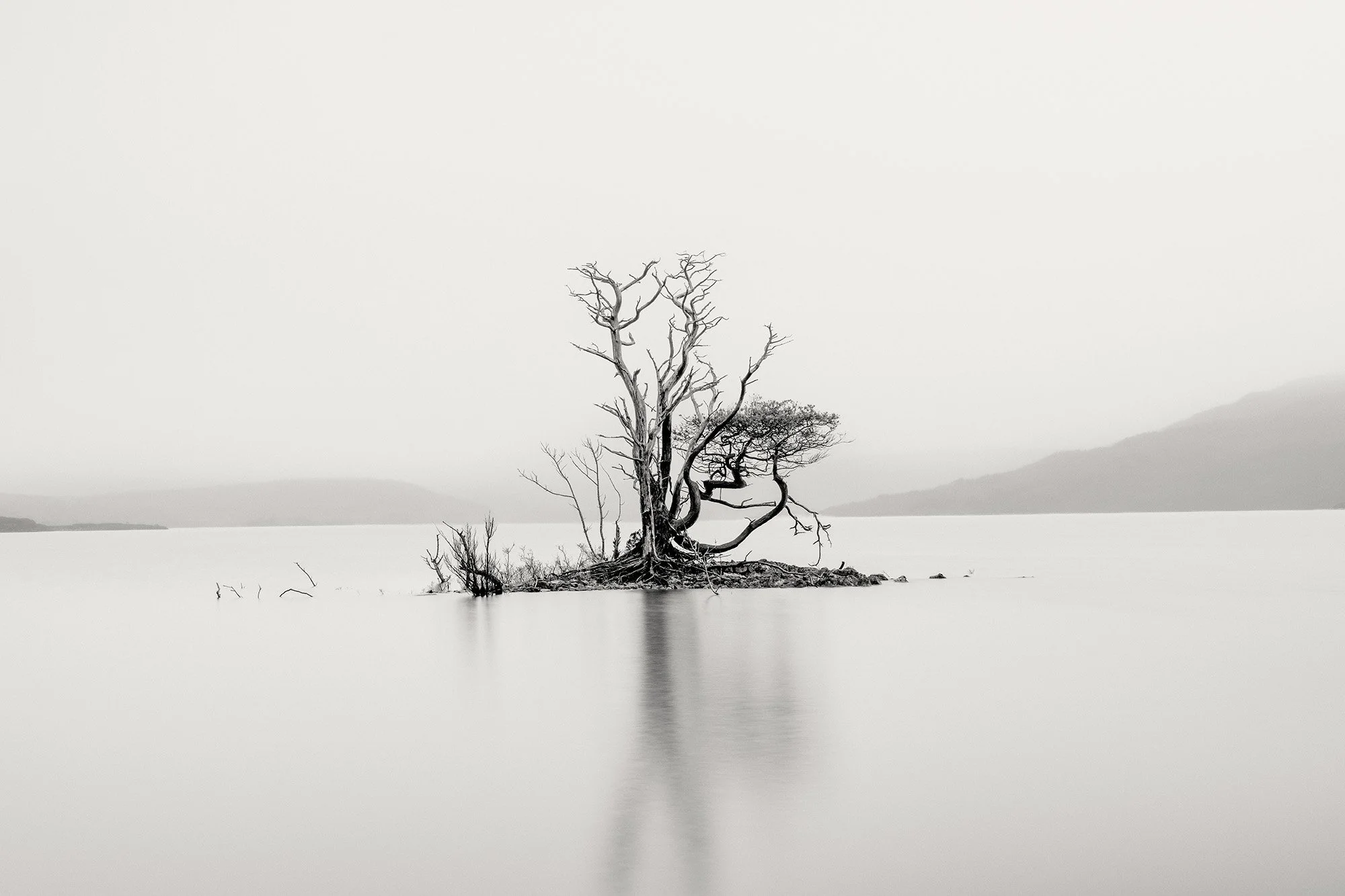
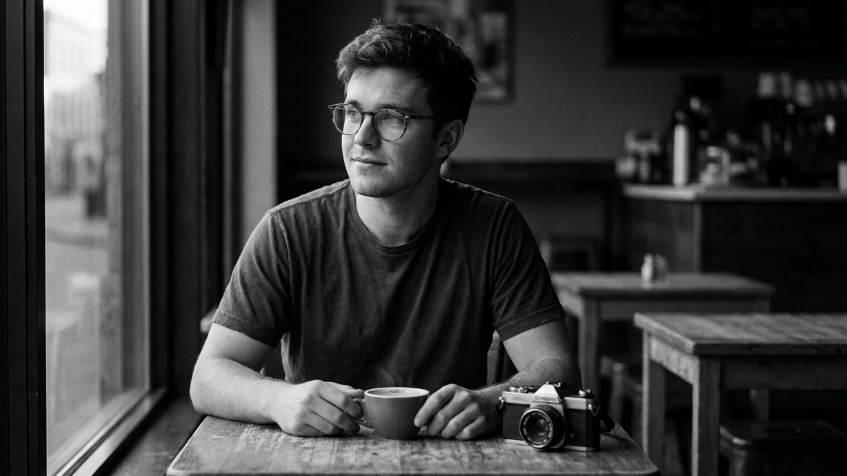
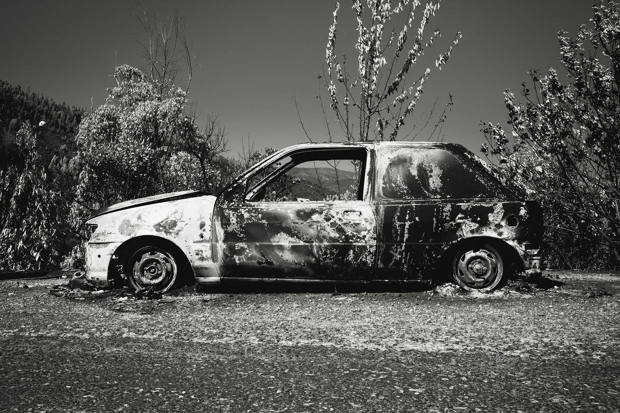
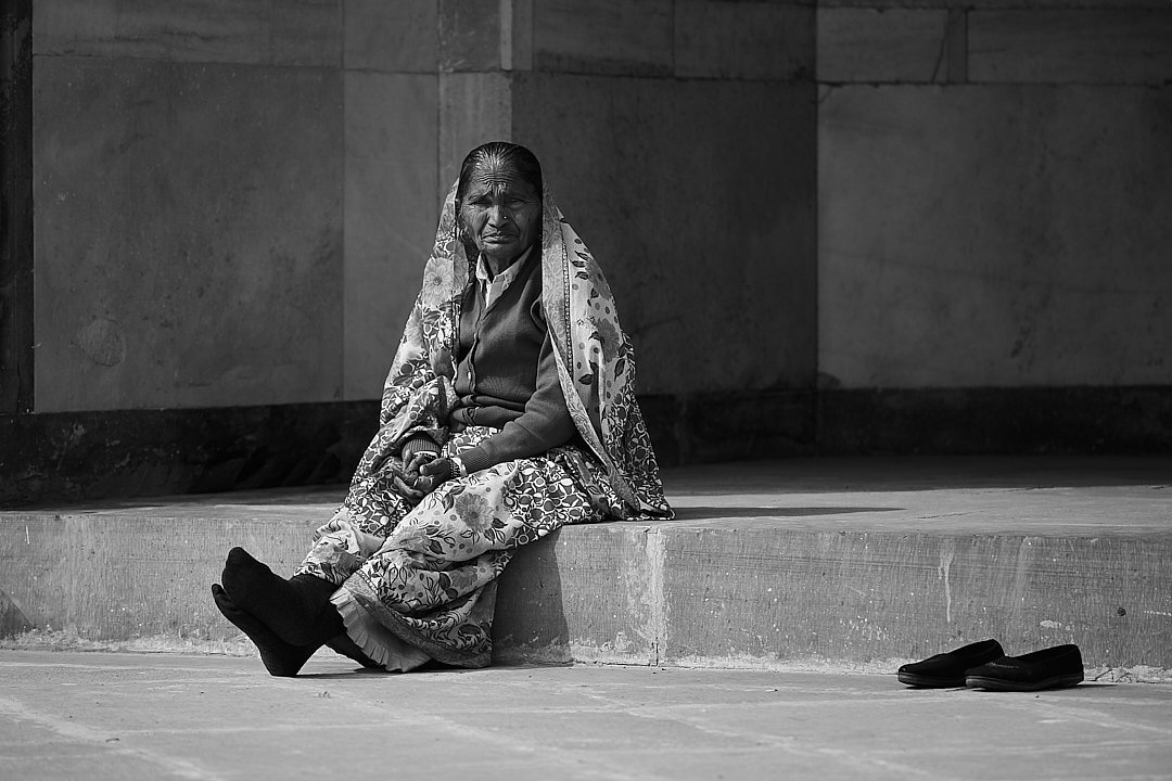
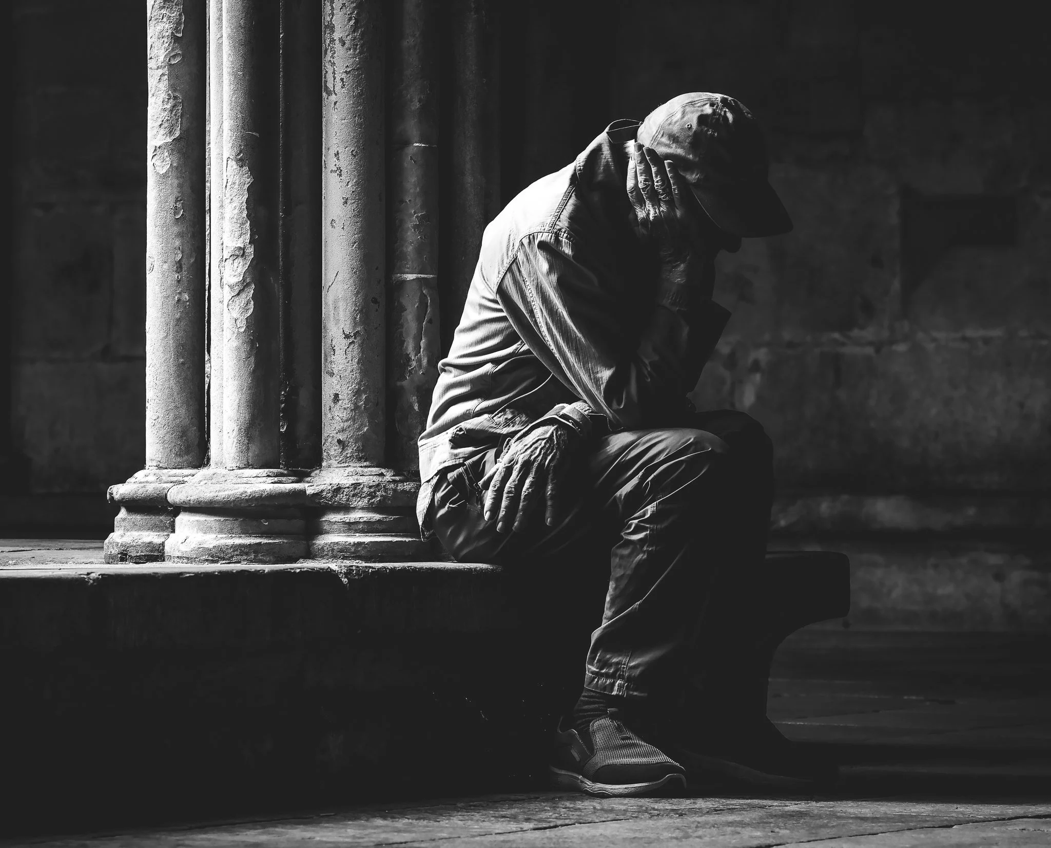
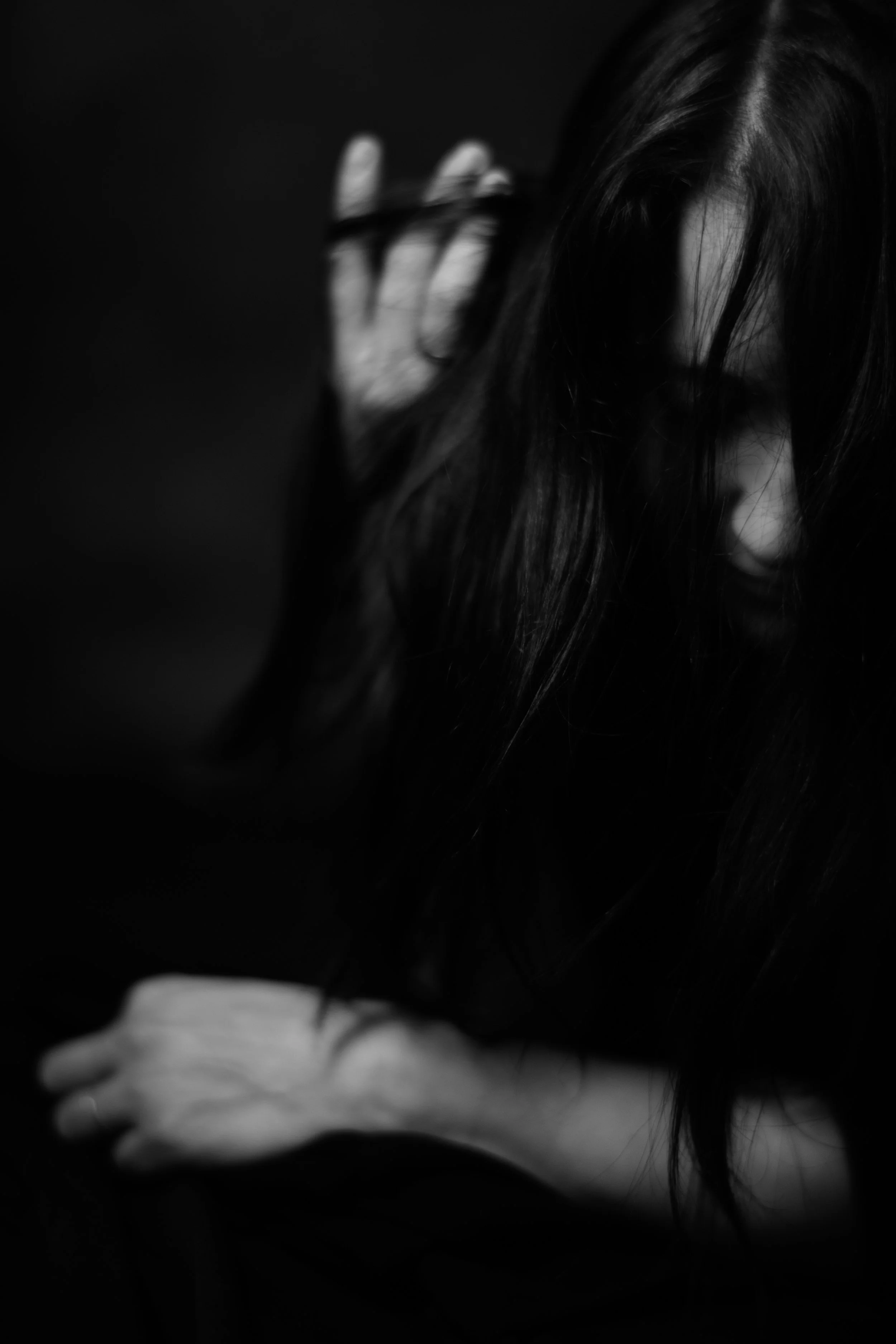
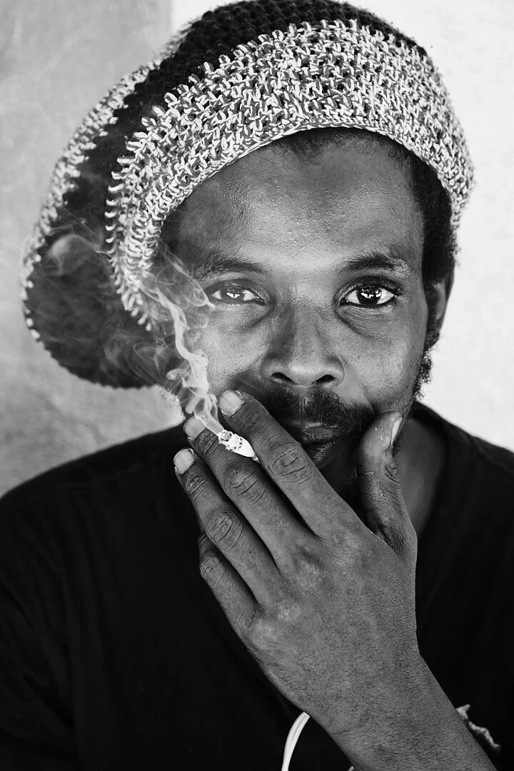
To Symbolize the Timeless: The few B&W shots that make the list often feel less about a specific event on a specific day, and more about a universal condition (poverty, isolation, childhood joy).
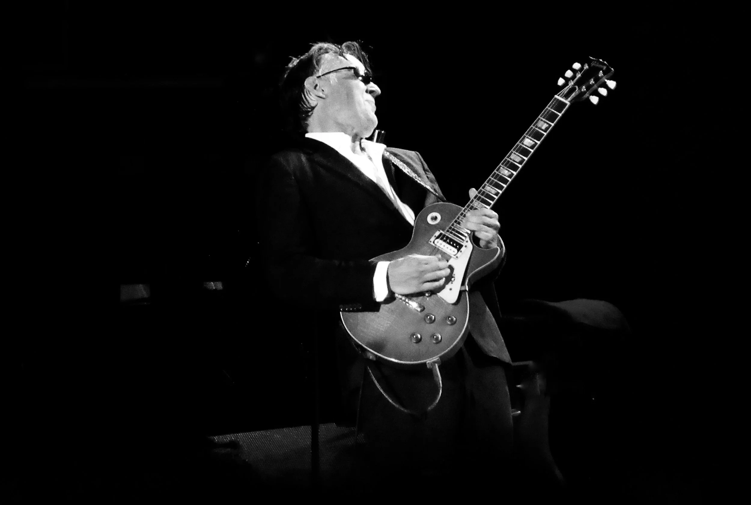
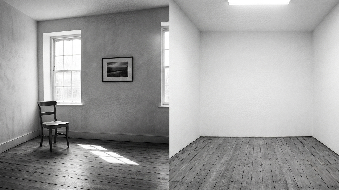
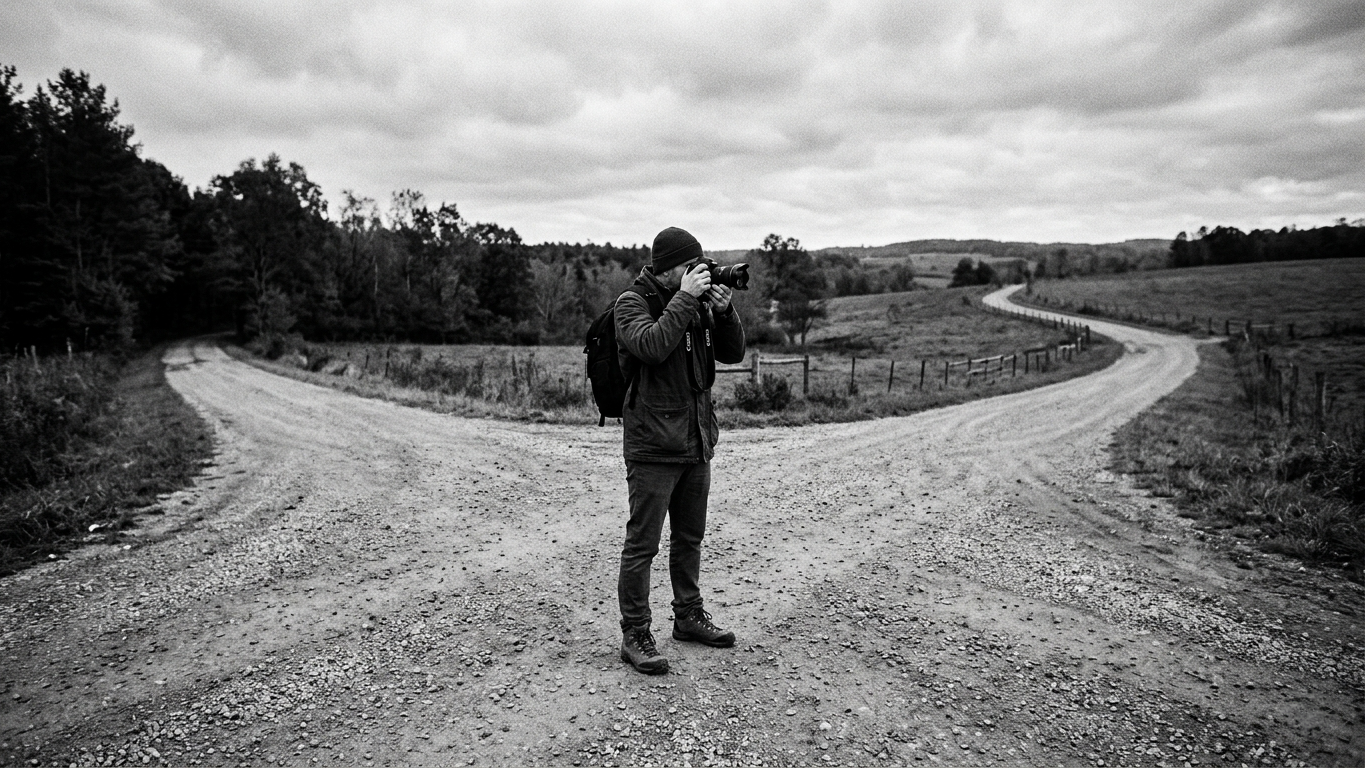
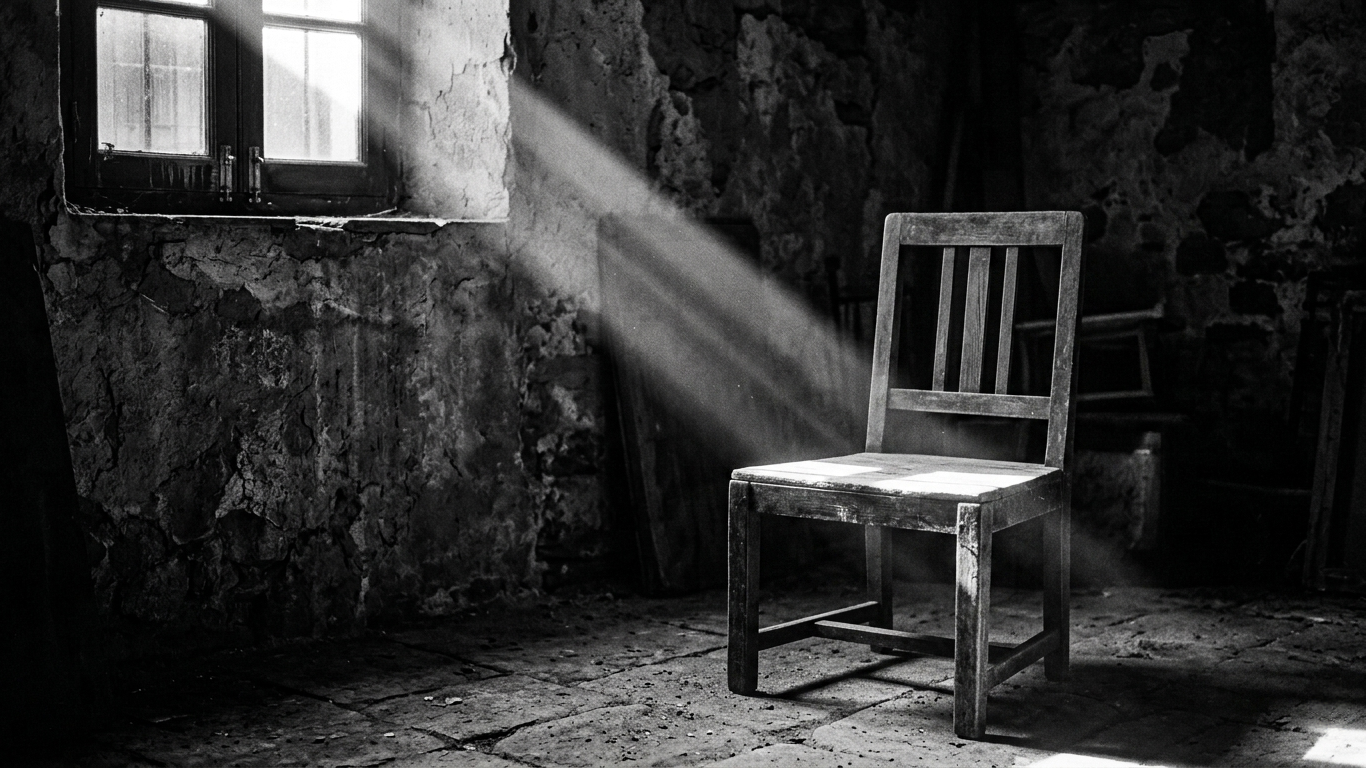
To Emphasize Texture and Form: B&W, by removing the distraction of color, is used when the photojournalist is trying to make a statement purely with light, shadow, and geometry.
The Lesson for us
Don't be discouraged by the 5% number. See it as a challenge and a sign of our unique power.
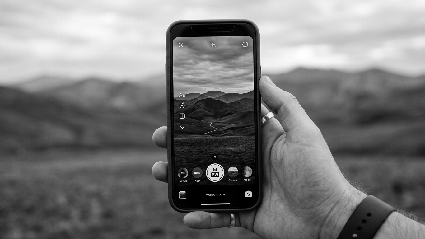
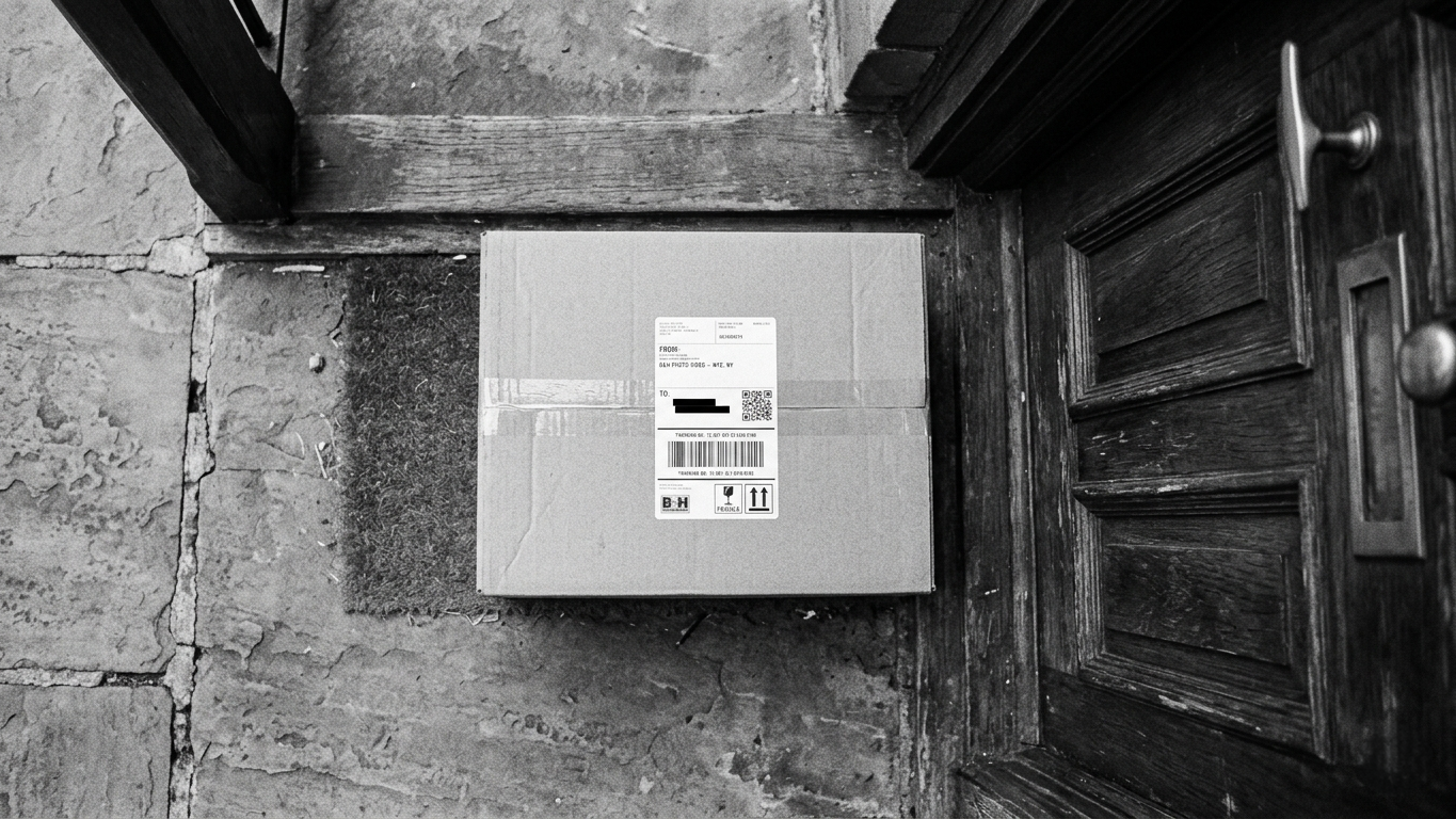
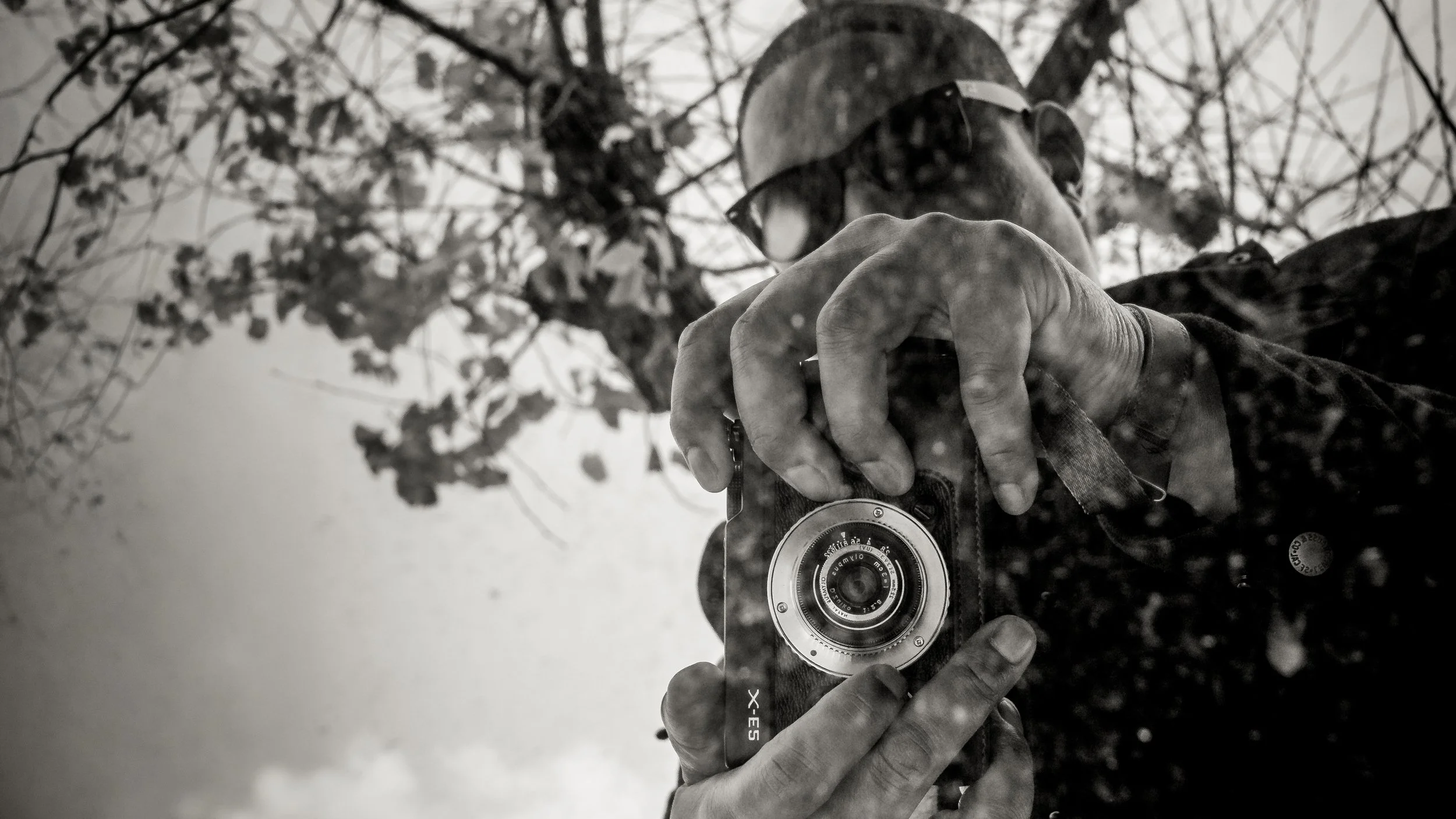
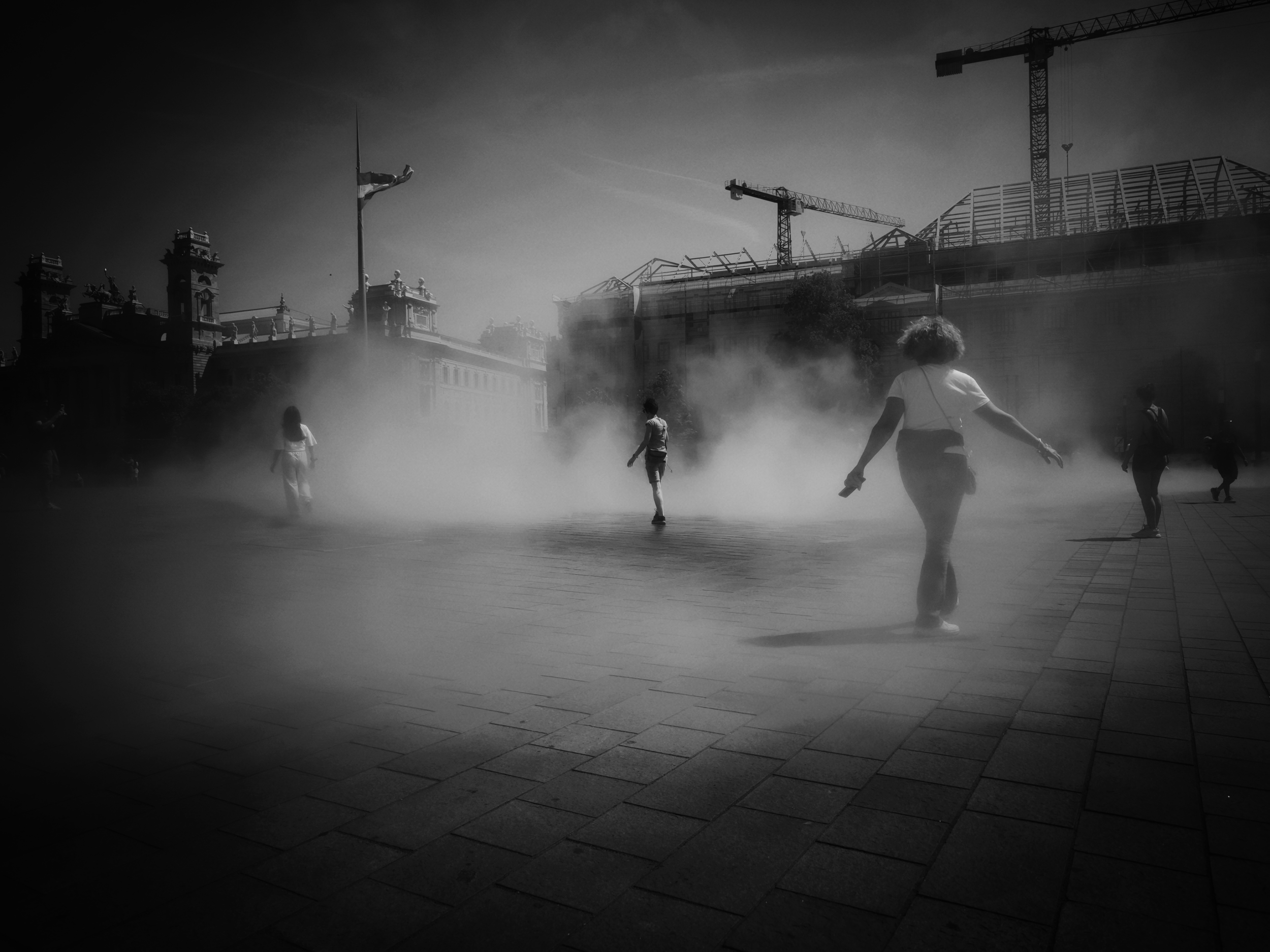
In a world saturated with digital color, our choice to shoot in black and white is no longer a necessity, it is a conscious, creative rejection of the surface detail.
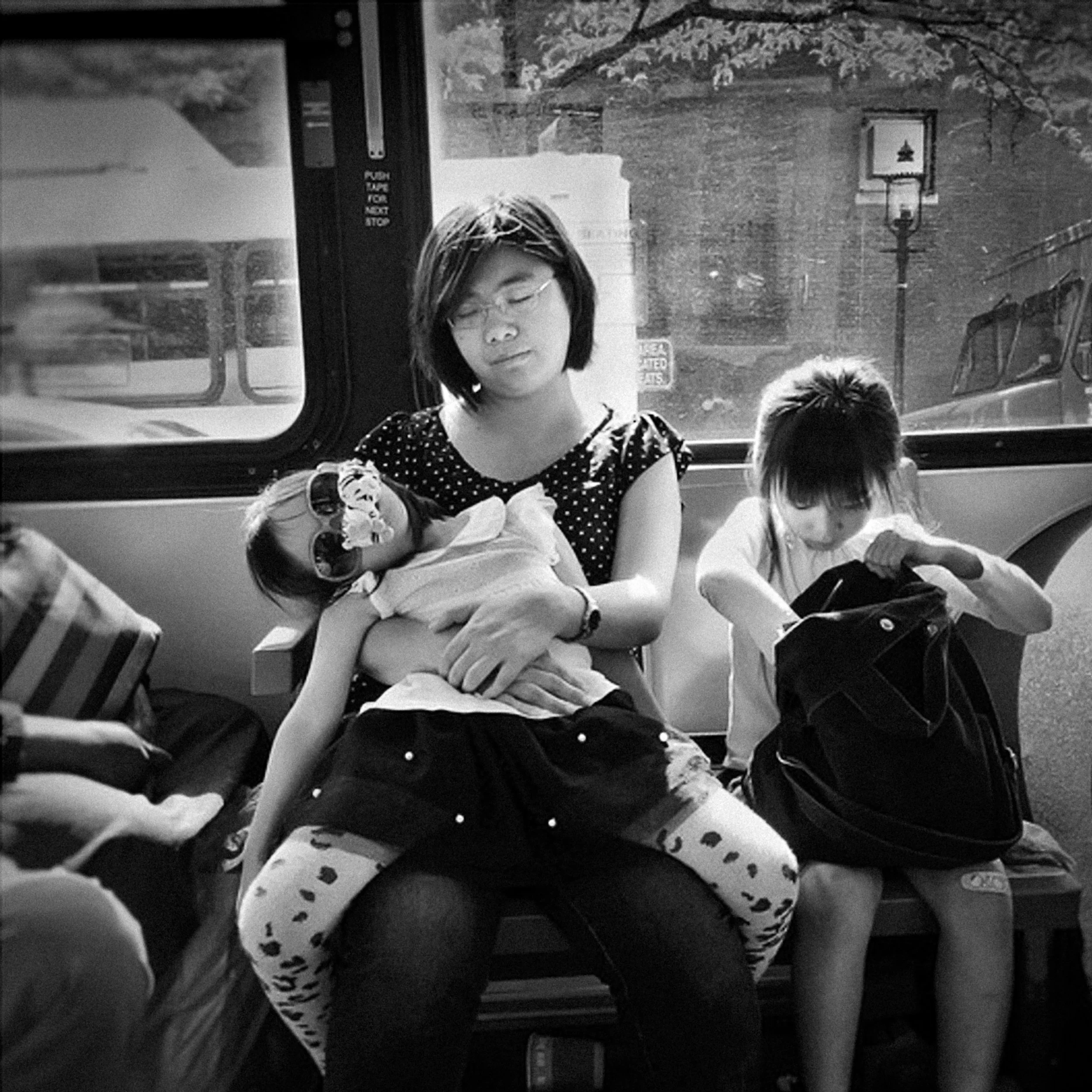
The vast majority of images are now made to grab attention with vibrant color. When we use monochrome, we are forcing the viewer to slow down, to engage with the light, and to look deeper into the composition and the emotional geometry of the moment. We are saying: "The color doesn't matter. The soul of this moment does."
So, while color wins the battle of the 100, let's keep fighting for the monochrome moment the one that, stripped bare, lasts forever.