Understanding the Vintage Look
Perfection is overrated. A practical guide to grain, tonal compression, and lens character and why embracing the flaw is the fastest path to images with genuine soul.
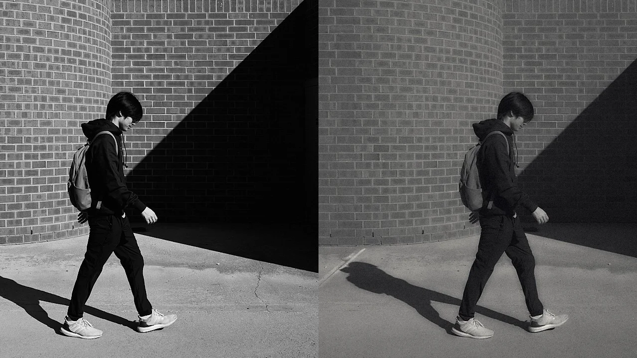
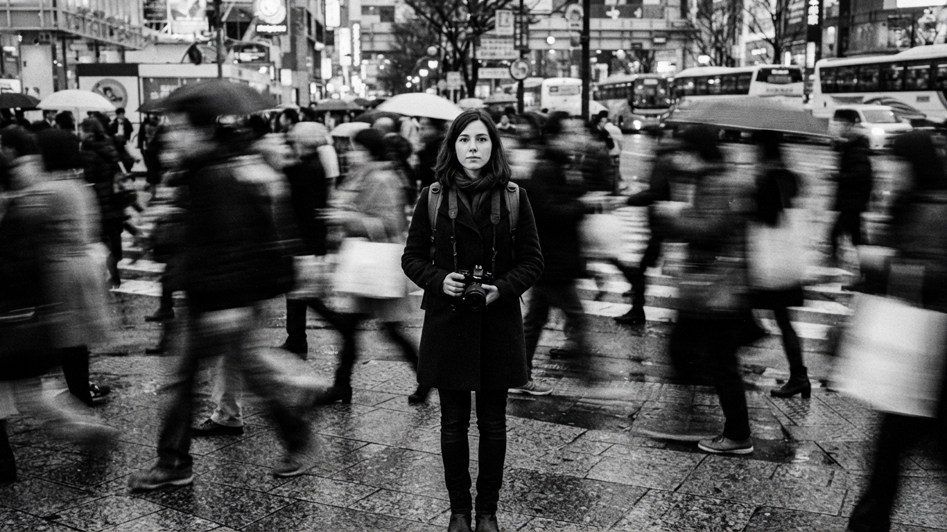
We live in an era of perfect images. Our sensors see more than our eyes do and our lenses are so sharp they can feel cold. When people talk about a vintage look they are usually looking for a sense of warmth, nostalgia, and humanity that clinical digital files often lack.
But vintage isn't just a filter you slap on an image. It is a combination of specific technical characteristics that mimic how film and older optics used to behave. If you appreciate the vintage look I would love to hear how you create it.
1. Tonal Compression
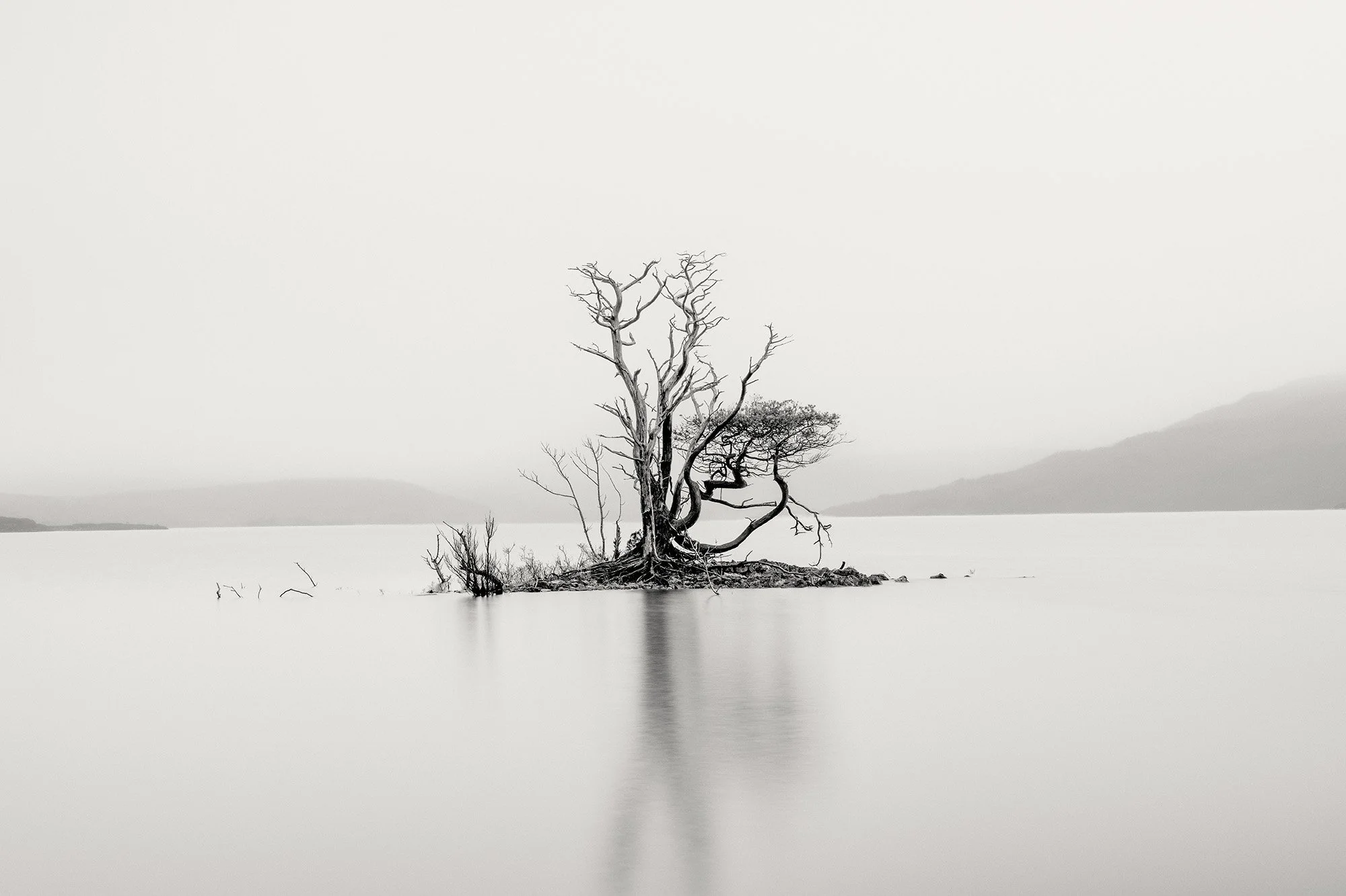
In modern digital photography we often chase true blacks and pure whites. Vintage photography rarely had this. Because of the way film was developed and aged, the blacks were often slightly lifted (dark grey rather than pitch black) and the highlights were rolled off (soft and textured rather than bright and clipping).
In your edits: Raise the bottom point of your tone curve slightly and drop the top point. You want the shadows to feel airy and the highlights to feel like old paper.
2. Grain
Digital noise is an error; film grain is a physical texture. Vintage monochrome is defined by the silver halide crystals in the film stock. Grain adds a sense of three dimensional depth and grit to an image that pixels cannot replicate.
In your edits: Do not just add noise. Add grain that varies in size based on the light. Traditionally grain is more visible in the mid tones and shadows than in the bright highlights.
3. Lens Character
Modern lenses are designed to eliminate flaws like chromatic aberration and flares. Vintage lenses embraced them. This includes halation (the glow around bright lights) and edge softness where the focus tapers off toward the borders of the frame.
In your edits: Use a Dehaze slider in the negative direction or a Clarity slider turned down to create a soft bloom. You can also apply a radial filter to the edges of your frame to slightly reduce sharpness or add a subtle vignette.
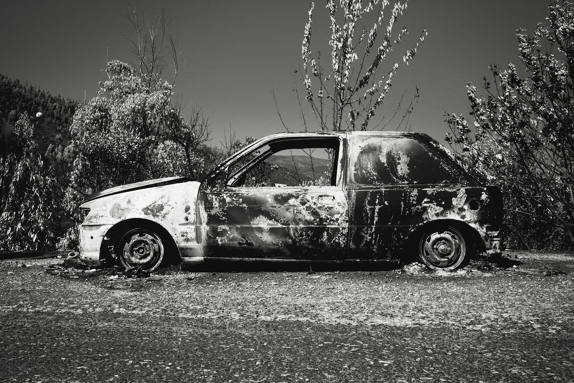
4. Chemical Toning
While we think of black and white as neutral, old prints were rarely just grey. They were influenced by the chemicals used in the darkroom. Sepia was used for archival stability while Selenium was used to deepen shadows and add a cool, purple black tone.
In your edits: Use the Color Grading or Split Toning panel. Add a tiny amount of cream or ivory to the highlights and a hint of deep blue or plum to the shadows. This creates a rich, metallic look that feels like a physical print.
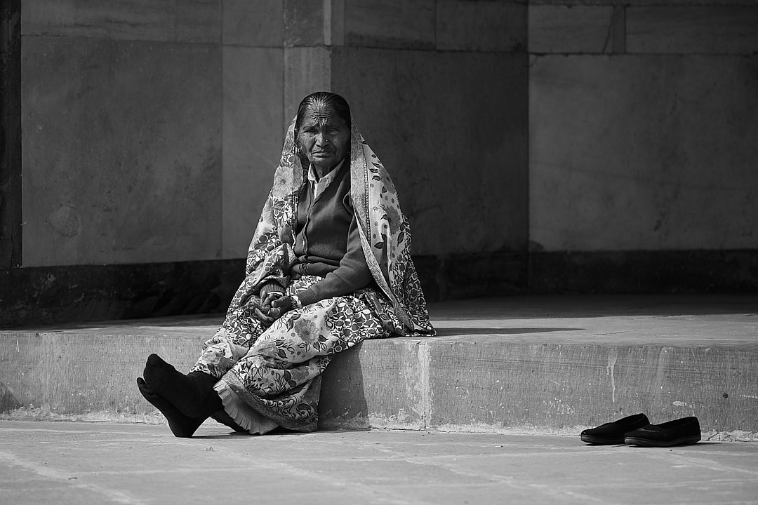
Why Black and White is the Perfect Canvas
Black and white is already an abstraction; it is a departure from reality. When you add vintage characteristics you are leaning into that abstraction. You are telling the viewer that this is not a literal record of what happened but a memory. Achieving a vintage look is about removing the digital signature. It is about making the image feel like it was crafted by light and chemistry rather than calculated by a processor.
IF YOU WOULD LIKE TO IMPROVE YOUR BLACK AND WHITE PHOTOGRAPHY TRY THE LESSONS BELOW.


A Beginners Guide To Black And White Photography