The Hidden Colors of Black and White
Strip away color and you don't lose temperature, you find it. How shifting the warmth of your monochrome tones can completely transform the emotional register of an image.
The biggest myth in photography is that black and white is neutral.
When we strip away the color spectrum we are not left with a mathematical absence of hue. We are left with tone. And tone has a temperature.
Even in the analog days a print was rarely truly neutral. The specific chemistry used in the darkroom, the base tint of the paper such as bright white or warm ivory, and post development toning processes like Sepia or Selenium all imparted a subtle color cast to the final image.
In the digital age we have infinite control over this. We do not have to accept the flat neutral grey that our camera produces when we hit monochrome mode. We can push our images toward warmth or cool them down into ice.
But this is not just an aesthetic choice; it is an emotional one. Understanding when to use cool tones versus warm tones is the difference between taking a picture and crafting a mood.
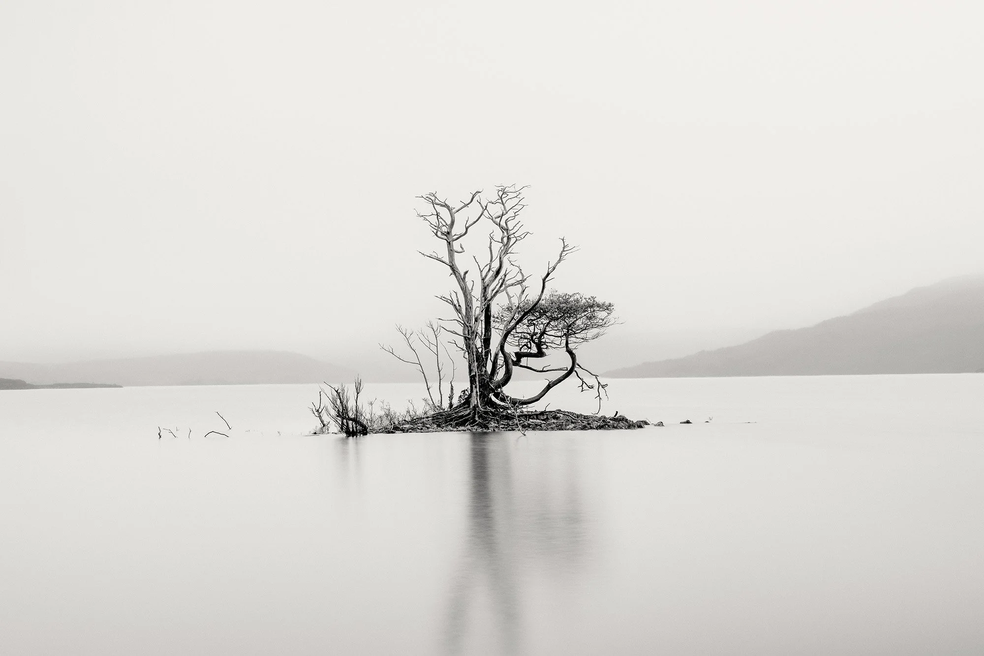
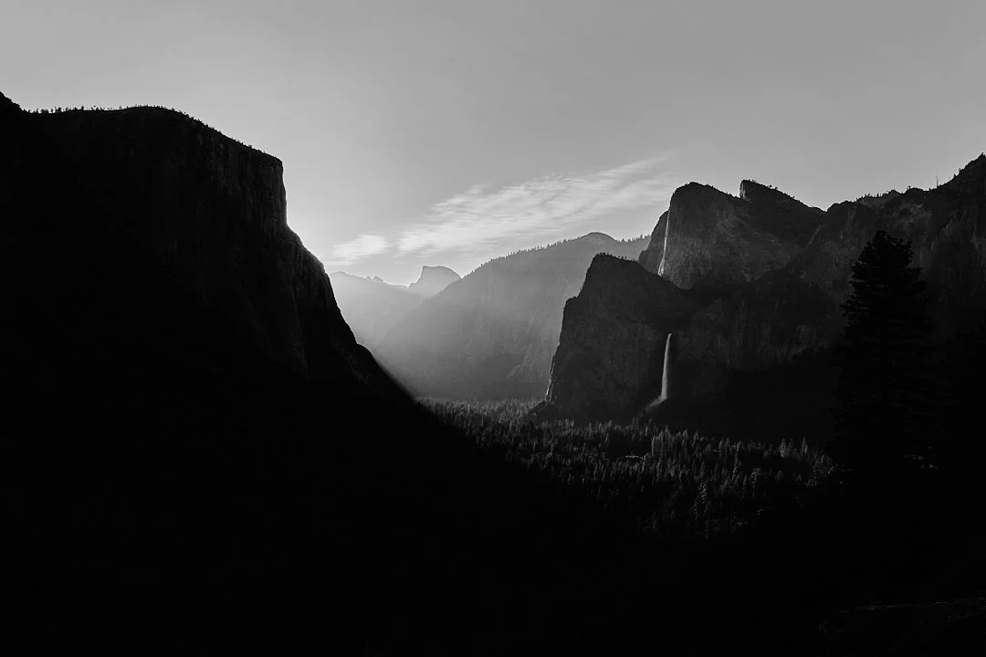
The Big Chill: Cool Tones
Cool tones introduce subtle blues, cyans, or steely purples into your shadows and mid tones.
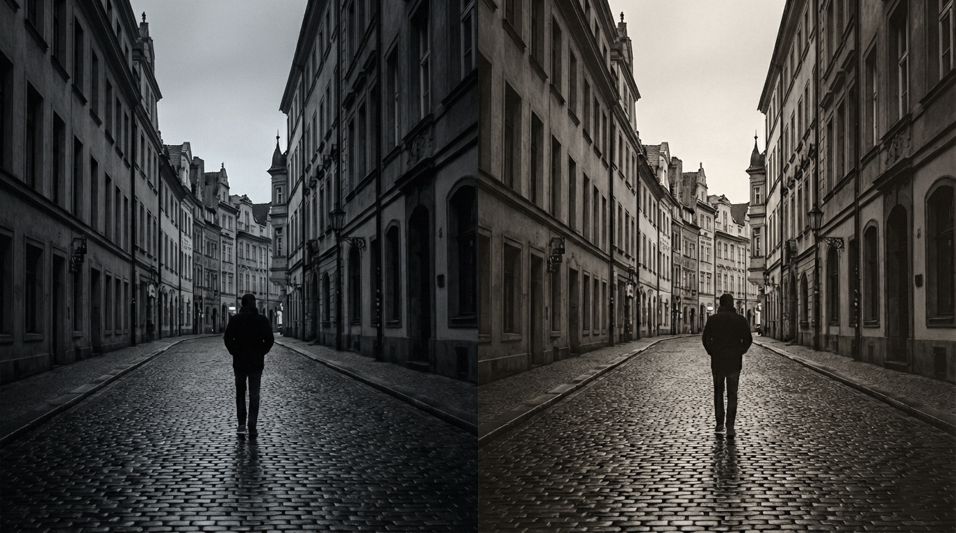
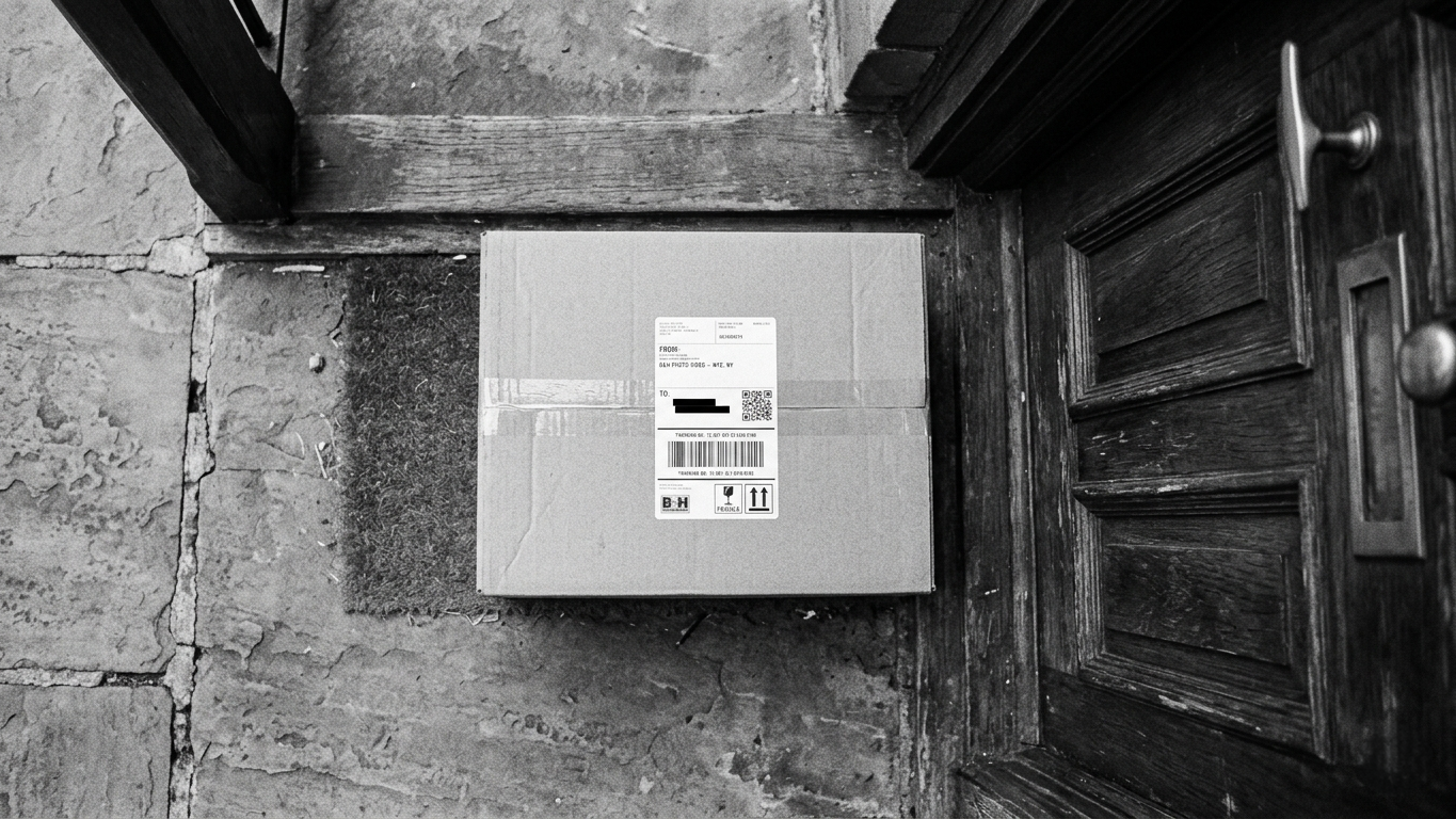
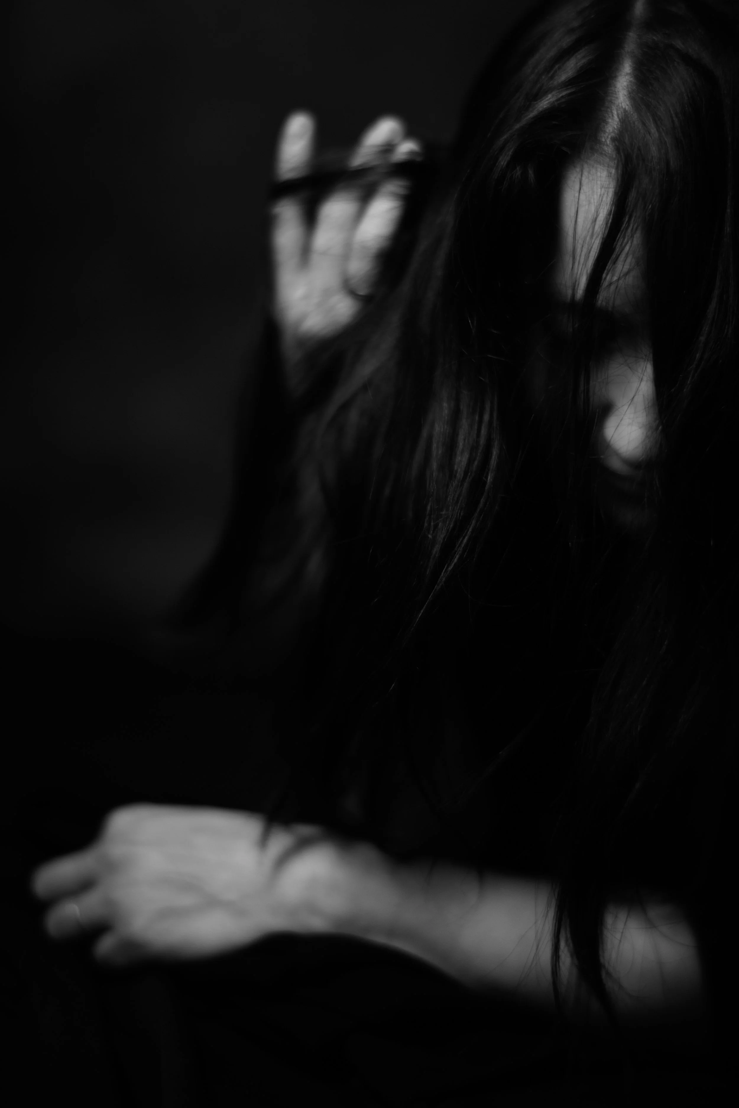
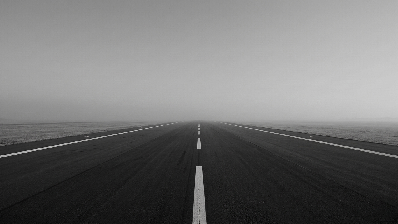
The Vibe Cool tones feel distant, modern, clinical, and sometimes harsh. They create a sense of separation between the viewer and the subject. They evoke winter, metal, concrete, and silence.
When to Use It
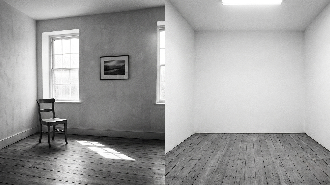
Architecture: Steel and glass structures thrive under a cool tone. It emphasizes their rigid inorganic nature.
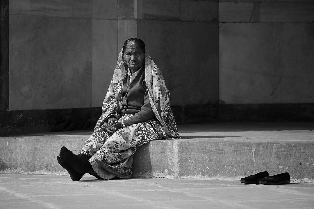
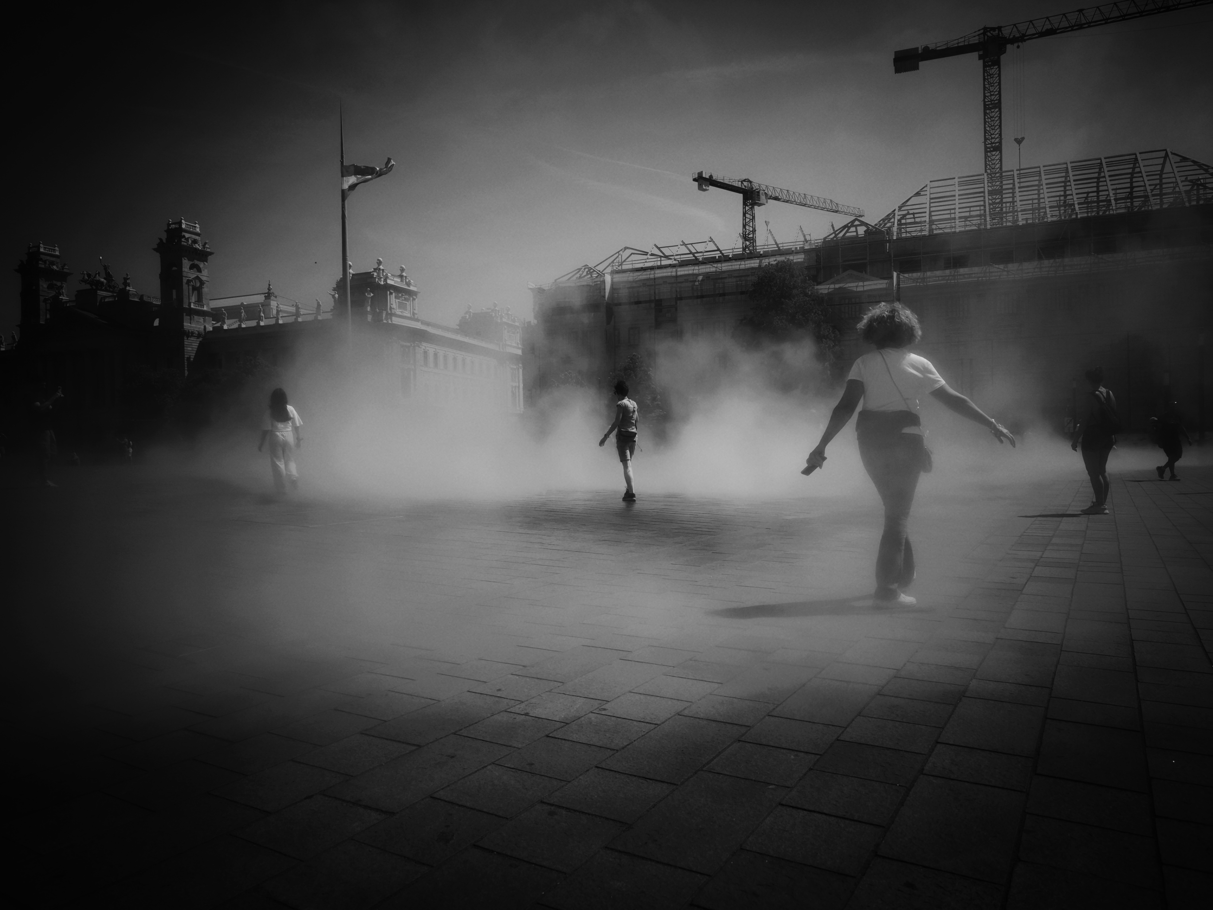
Isolationist Street Photography: If you are capturing a lone figure in a massive urban landscape a cool tone enhances that feeling of solitude and modern alienation.
High Contrast Noir: Deep inky blacks with a slight cyan shift can feel dangerous and cinematic.
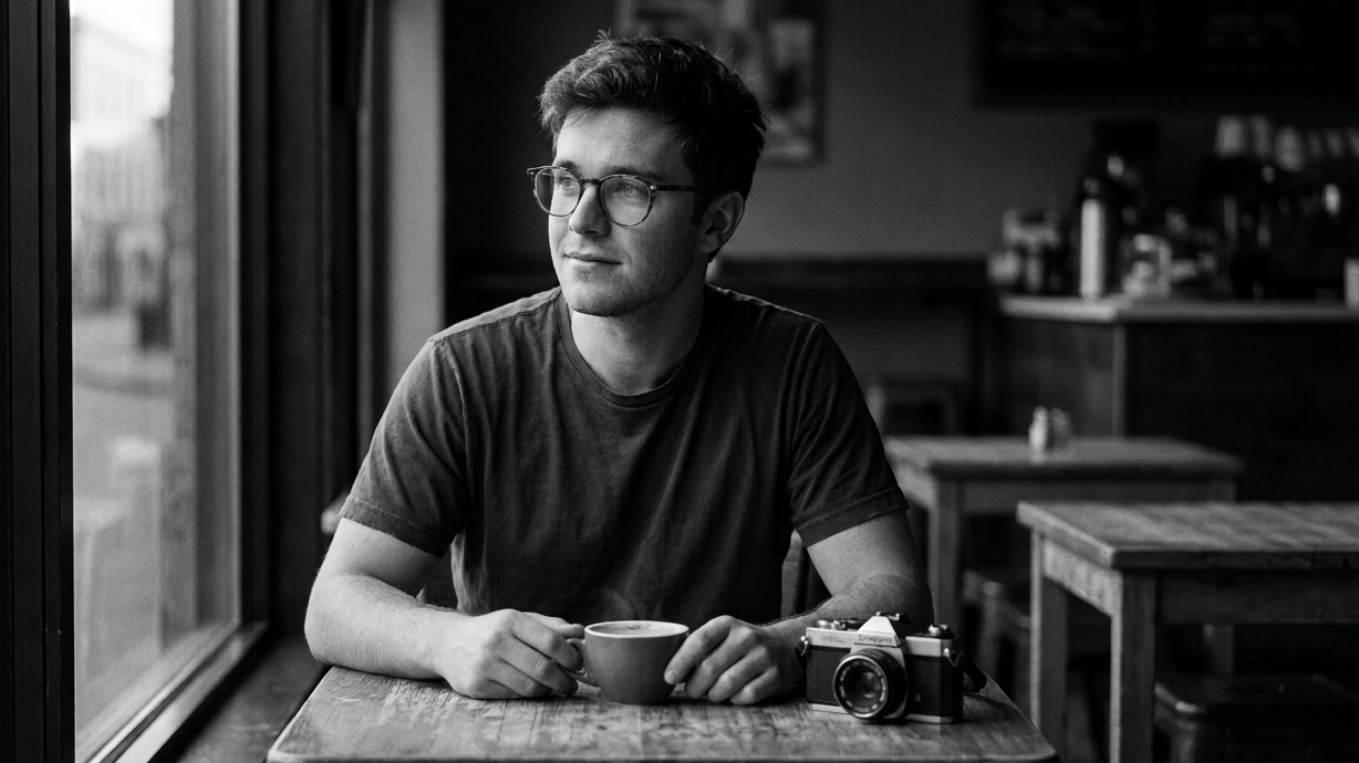
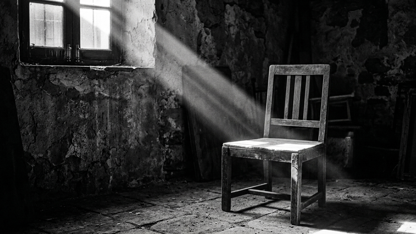
The Slow Burn: Warm Tones
Warm tones introduce creams, yellows, sepias, or reddish browns into your highlights and mid tones.
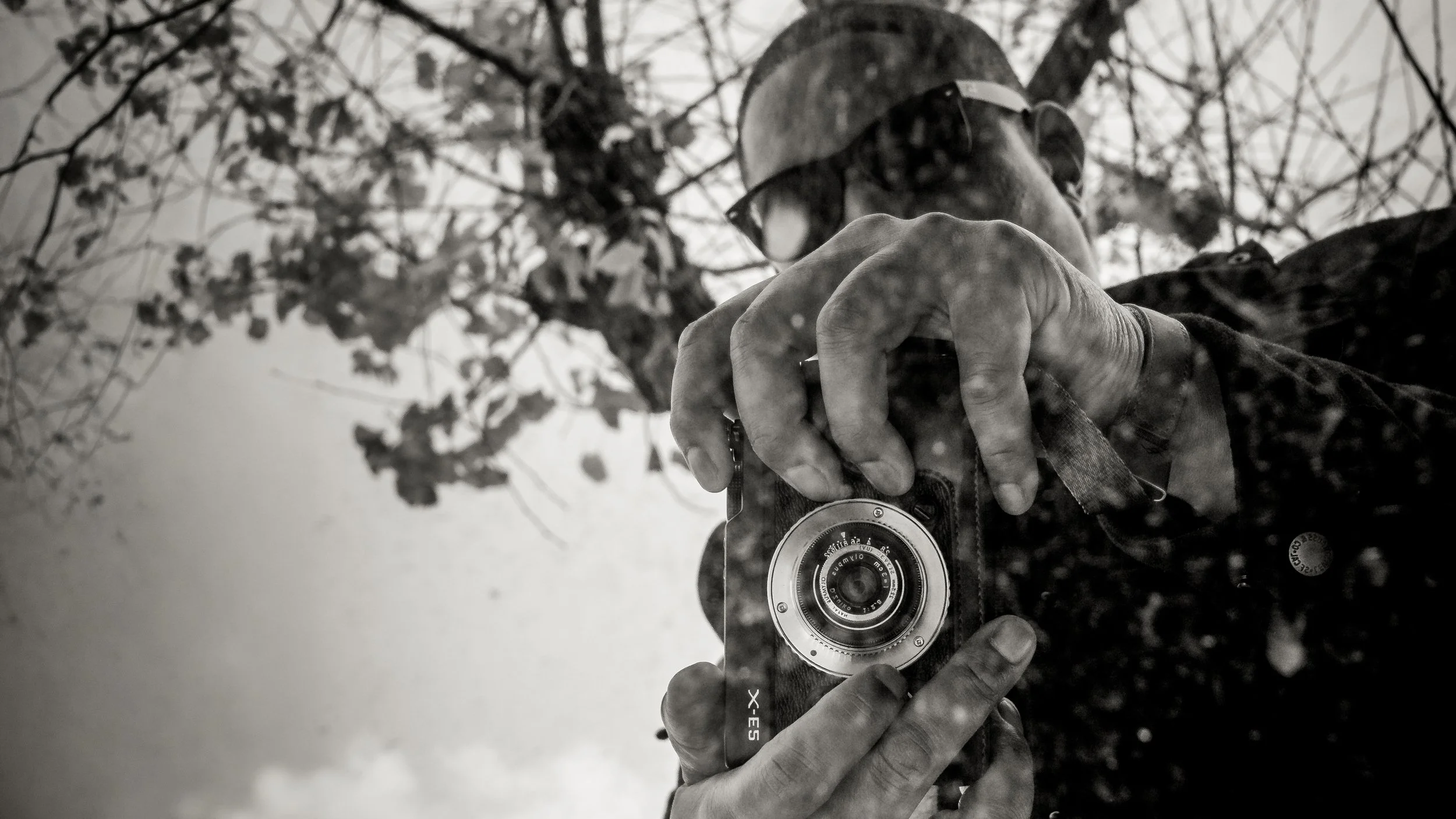
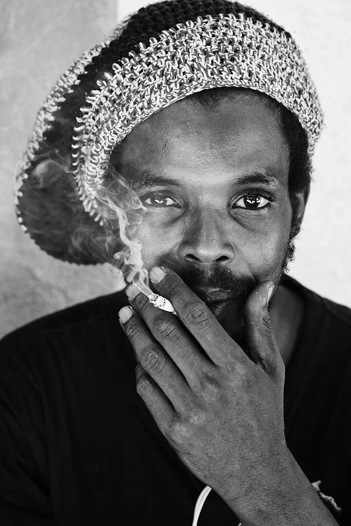
The Vibe Warm tones feel inviting, nostalgic, organic, and intimate. They mimic the look of aged paper or old chemical processes. They pull the viewer in and suggest a memory rather than a current event.
When to Use It
Intimate Portraits: A slight warmth in the highlights makes skin tones feel softer and more human. It removes the digital edge.
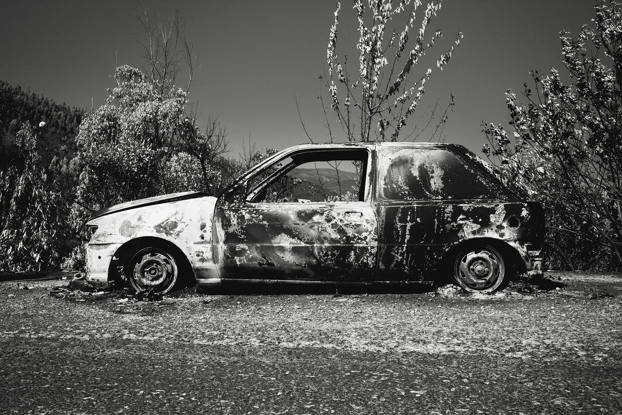
Nature and Landscapes: Organic textures like wood, leaves, and dirt often feel more tactile with a warm shift.
The Vintage Look: As we discussed previously aged film naturally leans warm. If you want nostalgia you need warmth.
How to Apply It
If you are using Lightroom or Capture One avoid the main Temperature slider once you have converted to monochrome. It is too blunt an instrument.
Instead head to the Color Grading panel.
The classic technique is split toning. Apply a very subtle cool tone to the shadows, perhaps a deep blue at five percent saturation, and a very subtle warm tone to the highlights like a creamy yellow at ten percent saturation. This creates color contrast that makes the image pop without looking unnatural.
Black and white photography is never just about shades of grey. By mastering temperature you gain a powerful tool to influence how your audience feels when they look at your work. Whether you choose the clinical precision of a cool blue or the nostalgic embrace of a warm cream the choice is yours to make. Stop thinking in grey and start thinking in temperature. Go experiment and find the tone that brings your vision to life.
IF YOU WOULD LIKE TO IMPROVE YOUR BLACK AND WHITE PHOTOGRAPHY TRY THE LESSONS BELOW.


A Beginners Guide To Black And White Photography