A Reminder Why We Choose Monochrome
In a world of noise and color, going quiet is a radical act. What a Kodak Super Bowl campaign reminded us about the enduring power of black and white.
In a world of high gloss, color saturated Super Bowl commercials, this year brought a rare gift for those of us who live in the world of light and shadow.
Director Yorgos Lanthimos and Emma Stone teamed up for a Squarespace campaign that feels less like a commercial and more like a manifesto for the monochrome aesthetic.
Here is why this matters for our collective.
The Texture of Tradition
The campaign wasn't just "filtered" to look black and white. It was shot on Kodak 2302, a very specific, slow speed film stock traditionally used for cinema print positives rather than as a camera negative. The result is a rich tonal structure and a distinct, fine grain texture that digital sensors still struggle to replicate. It reminds us that the medium we choose dictates the soul of the image.
Respecting the Frame
In a bold move for a modern broadcast, they kept the 4:3 aspect ratio and included the negative film frame borders. Instead of cropping the image to fit our wide screens, they forced the screen to fit the art. It’s a lesson in "Ma" using the borders and the "dead space" to give the subject more presence and height.
The Message for the Steward
What I love most about this is the intentionality. In the middle of the loudest, most colorful television event of the year, they chose silence, contrast, and film grain. It proves that monochrome isn't a limitation; it’s a way to cut through the noise. It’s a reminder that when you strip away the color, the emotion has nowhere to hide.
IF YOU WOULD LIKE TO IMPROVE YOUR BLACK AND WHITE PHOTOGRAPHY TRY THE LESSONS BELOW.


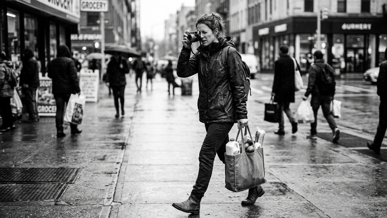
Capturing the Drama of Everyday Life In Black And White Photography

Featured Articles


Darren Pellegrino is a working photographer and the founder of The Monochrome Collective. He believes that black and white photography is not a style, it is a discipline. One that forces you to see light, shadow, and composition with absolute clarity. The Monochrome Collective was built for photographers who share that obsession and who are ready to trade the algorithm for real creative connection.
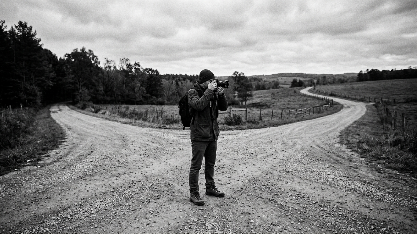
A Beginners Guide To Black And White Photography