How to Build a Portfolio That Actually Gets Looked At
Getting someone to open your portfolio is the hard part. Here is how to do it on foto.
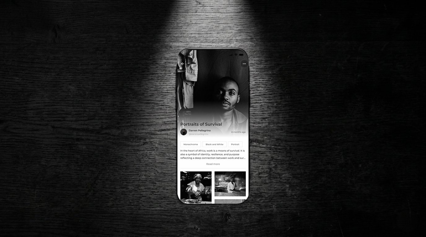
Foto's portfolio feature is genuinely useful. The ability to group a set of images into a single post with a cover, a title, and a description gives photographers something most social platforms do not. A way to share work as a sequence rather than a single frame. A body of work rather than a highlight. Context rather than just an image.
But a portfolio feature is only as good as the thought that goes into it. Most portfolios on Foto get scrolled past because they do not give anyone a reason to stop. Here is how to build one that does.
The cover image is everything
Your cover image is the only thing standing between someone stopping and someone scrolling. It is doing the same job a magazine cover does. Communicating in a single frame what the work is about and why it is worth your time. Most people choose their favorite image from the set as the cover. That is not always the right call.
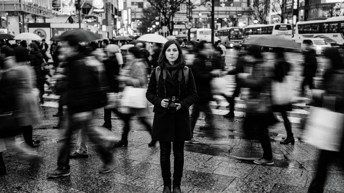
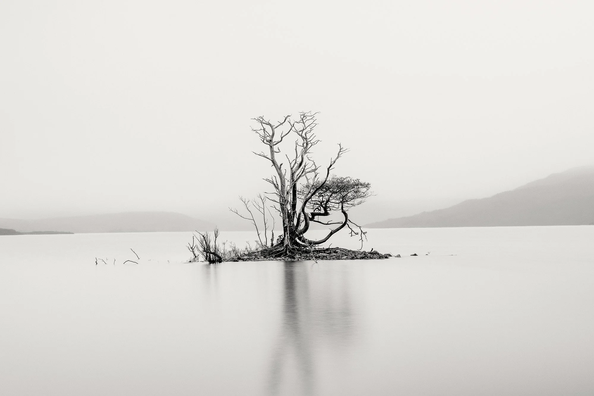
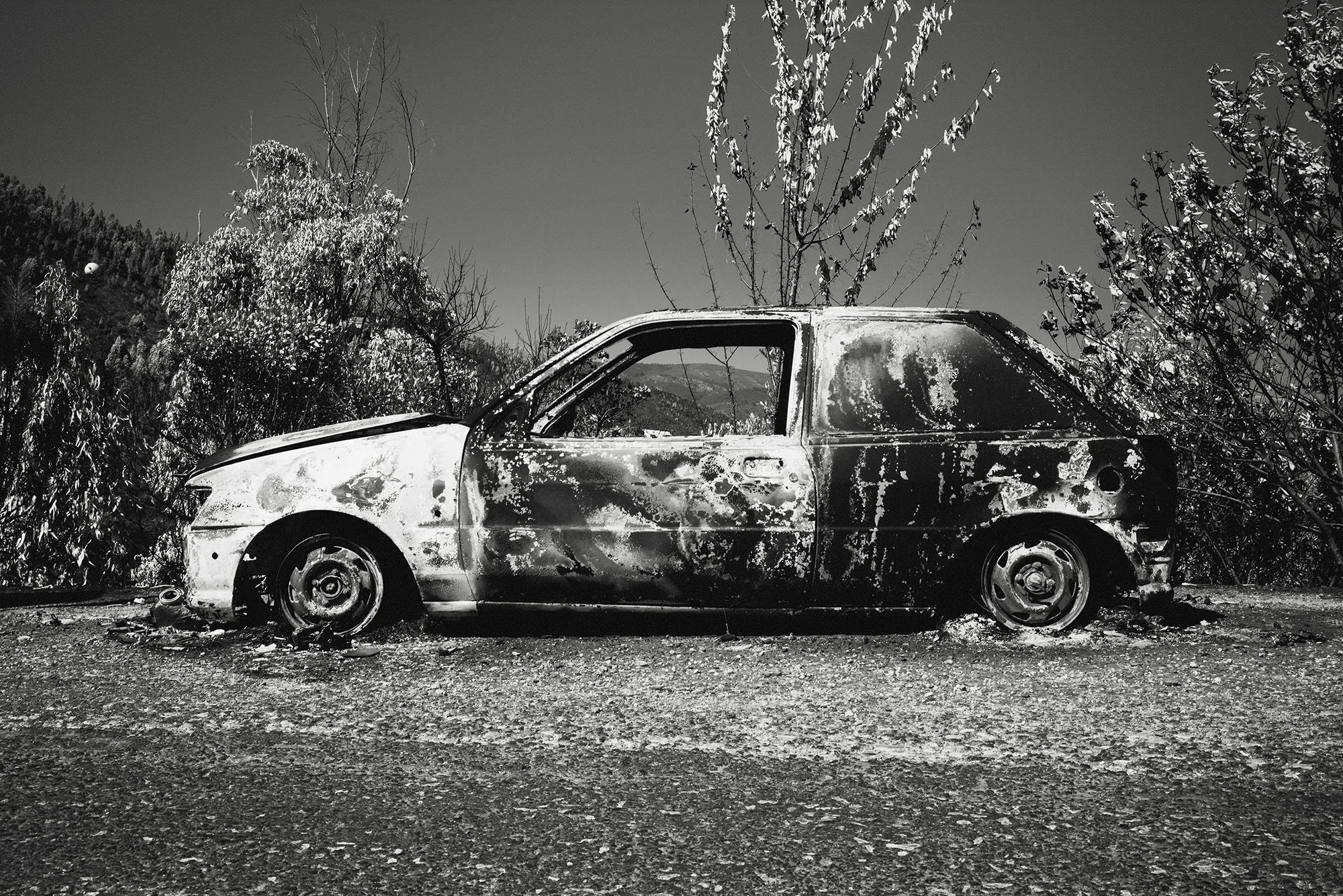
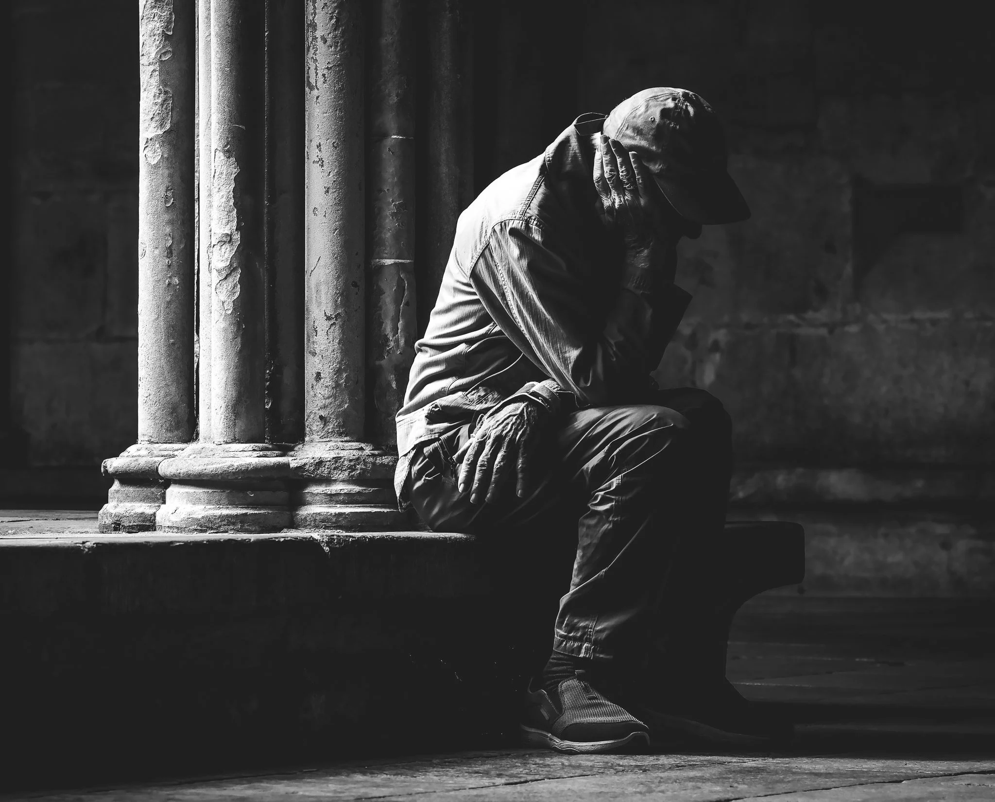
Your cover image does not need to be the strongest photograph in the portfolio. It needs to be the most immediately arresting one. There is a difference. A subtle, slow-burning image that rewards extended looking might be your best photograph but it makes a poor cover because it asks too much of someone moving quickly through a feed. Your cover needs to work in about half a second.
Think about graphic impact. Strong contrast. A clear subject. Something that creates an immediate question in the viewer's mind that can only be answered by opening the portfolio. A face that demands to be looked at. A composition so unusual it creates instant curiosity. A moment so precisely caught that the viewer wants to know more.
Dark high contrast images tend to stop the scroll more effectively than bright airy ones. A single strong element in the frame works better than a complex scene. And the image should hint at what the rest of the portfolio contains without giving everything away. You are writing a first sentence not a summary.
Tell a story with your words
The description field in a Foto portfolio is not a caption. It is not a place for technical information or a list of locations and dates. It is one of the most underused storytelling tools available to photographers on the platform and most people treat it like an afterthought.
The description is where you bring the viewer into the work before they have even seen the first image. Use it to tell the story behind the portfolio. Not a summary of what is in the photographs but the human story that made the work exist. Where you were and why you went there. What you were looking for. What you found that you were not expecting. The moment that made the whole thing click into place. The feeling you were chasing.
Think of it the way a documentary filmmaker thinks about a voiceover. Not explaining what the viewer can already see but giving them the emotional and contextual layer that the images alone cannot carry. A reader who finishes your description and then starts scrolling through the images is a different kind of viewer than one who just starts scrolling cold. They are already inside the work.
The description field gives you room to write properly. Use it. Two or three paragraphs of genuine storytelling will do more for your portfolio than any technical detail or location tag. Write it the way you would tell a friend about the project over a drink. Plain language. Honest. The real reason you made this work and what it meant to you.
A strong title sets the hook. The description reels them in. Together they should make someone feel they would be missing something by not opening the portfolio.
Sequencing is the difference between a portfolio and a pile of images
This is the part most photographers spend the least time on and it is arguably the most important. The sequence of your images is not just an order. It is an argument. It is the shape of a story. Done well it creates a rhythm that carries the viewer from one image to the next with a growing sense of understanding. Done badly it makes even strong individual images feel random and disconnected.
Start with an image that establishes the world you are taking the viewer into. Not necessarily your strongest image but one that sets the tone, the location, the emotional register. Give the viewer their bearings before you take them anywhere unexpected.
Build through the middle. Vary the pace. A wide establishing shot followed by a tight detail. A moment of stillness followed by a moment of energy. A face followed by an environment. The viewer's eye needs to be guided and occasionally surprised. If every image has the same energy and the same distance from the subject the sequence becomes monotonous regardless of how strong the individual frames are.
End with an image that leaves the viewer somewhere. Not necessarily a resolution but a feeling. The last image in a portfolio is what the viewer carries away. It should be one that lingers. Something open enough that the viewer's imagination keeps working after they have closed the portfolio.
Lay your images out in a row and look at them as a sequence before you publish. Ask yourself where the pace changes. Where the viewer's eye gets a rest. Where it gets pulled forward. If you cannot feel the rhythm of the sequence the viewer will not feel it either.
How many images to include
Less than you think. Almost always less than you think.
The temptation when building a portfolio is to include everything good from a project. Resist it. A portfolio of twenty images where fifteen are strong is weaker than a portfolio of ten where every single one earns its place. Editing is where the real work happens and most photographers stop editing too early.
For a Foto portfolio the sweet spot is somewhere between eight and fifteen images depending on the project. Fewer than eight and there is not enough weight to the work. More than fifteen and you are asking the viewer to do too much. Attention is finite and a viewer who feels a portfolio is going on too long will stop engaging before the end, which means your strongest images at the back of the sequence will never be seen.
When in doubt cut. If you are uncertain whether an image should be in ask yourself whether it adds something the other images do not. If it is saying something another image in the sequence already says cut it. Every image in the portfolio should be doing a job that no other image in the set is already doing.
Ready to see the world differently? The Monochrome Method is a complete video course with lessons and assignments designed to help you craft compelling black and white images and build a portfolio that's unmistakably yours. Start Learning Today.
IF YOU WOULD LIKE TO IMPROVE YOUR BLACK AND WHITE PHOTOGRAPHY TRY THE LESSONS BELOW.


A Beginners Guide To Black And White Photography