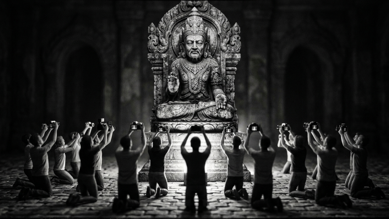
The Secret to Depth in a Black and White Photograph
Most photographers edit the highlights and shadows and wonder why their images still feel flat. Here is what they are missing.
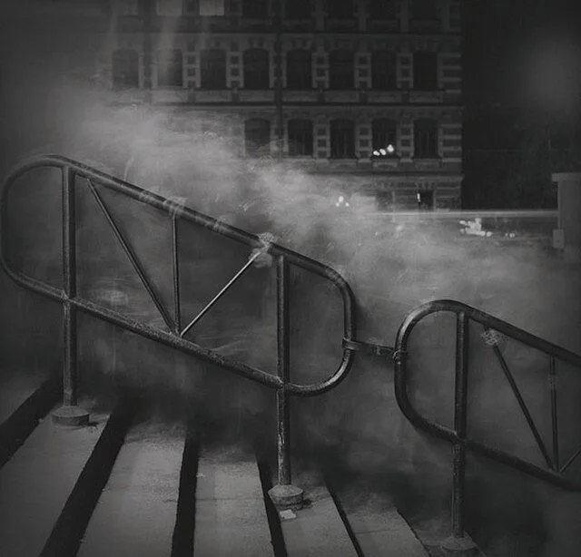
A photograph is a flat object. Light hits a sensor and gets recorded on a plane. There is no actual depth. No real space. No genuine three dimensions. Everything that makes an image feel like a place you could step into rather than a surface you are looking at is an illusion. And the photographer and the editor are both in the business of constructing that illusion as convincingly as possible.
This matters more in black and white than it does in color. Color gives the eye depth information automatically. Warm tones advance toward the viewer. Cool tones recede. Saturated colors feel closer than desaturated ones. The eye uses all of this subconsciously to build a sense of space without being asked. Take the color away and all of that information disappears. What you are left with is light and shadow and tonal contrast. That is all you have. So you had better use it well.
What depth actually does
Depth in a photograph does three things that are worth understanding before you open your editing software.
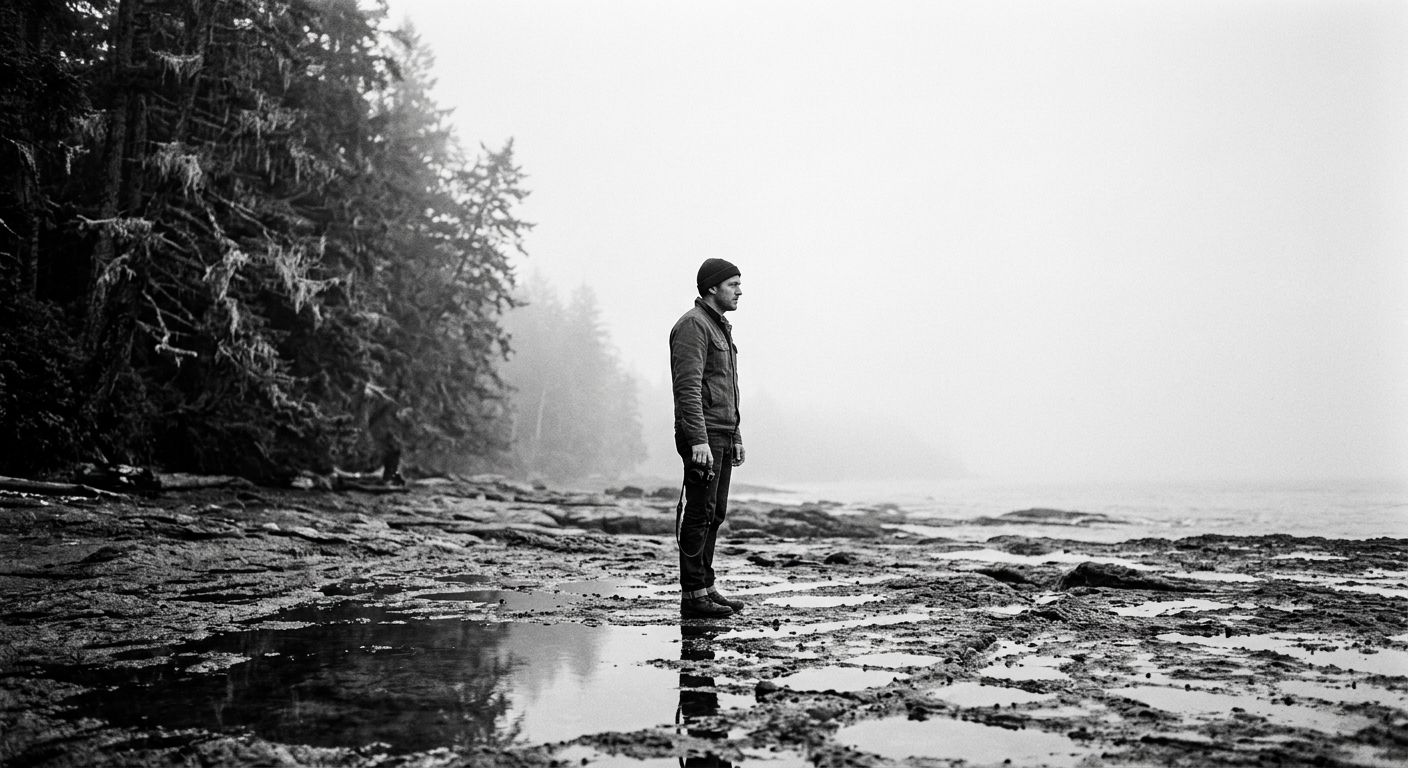
It creates presence. An image with genuine depth feels like a place. The viewer does not stay on the surface of it. They enter it. An image without depth feels like a record of something rather than an experience of it. You look at it rather than into it. That difference is felt immediately even by people who could not explain why.
It creates hierarchy. When an image has depth the eye knows instinctively where to look first, where to go next, and what is background. The subject occupies space rather than floating on a plane with everything else competing for the same visual weight. Depth is one of the most powerful tools for directing attention and it works silently without the viewer noticing it is happening.
It creates mood. Shallow depth can feel intimate or claustrophobic depending on the subject. Deep space can feel expansive or lonely. The three dimensionality of an image is one of its most significant emotional registers and most photographers manage it accidentally rather than deliberately.
Where photographers go wrong
Ask most photographers how they add depth to a black and white image and they will talk about highlights and shadows. Protect the highlights. Open the shadows. Add global contrast. All of this is real and all of it matters. But highlights and shadows are the endpoints of the tonal range. They are the anchors at either end of the scale and they are not where the eye actually lives in most images.
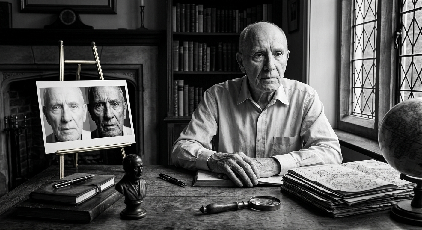
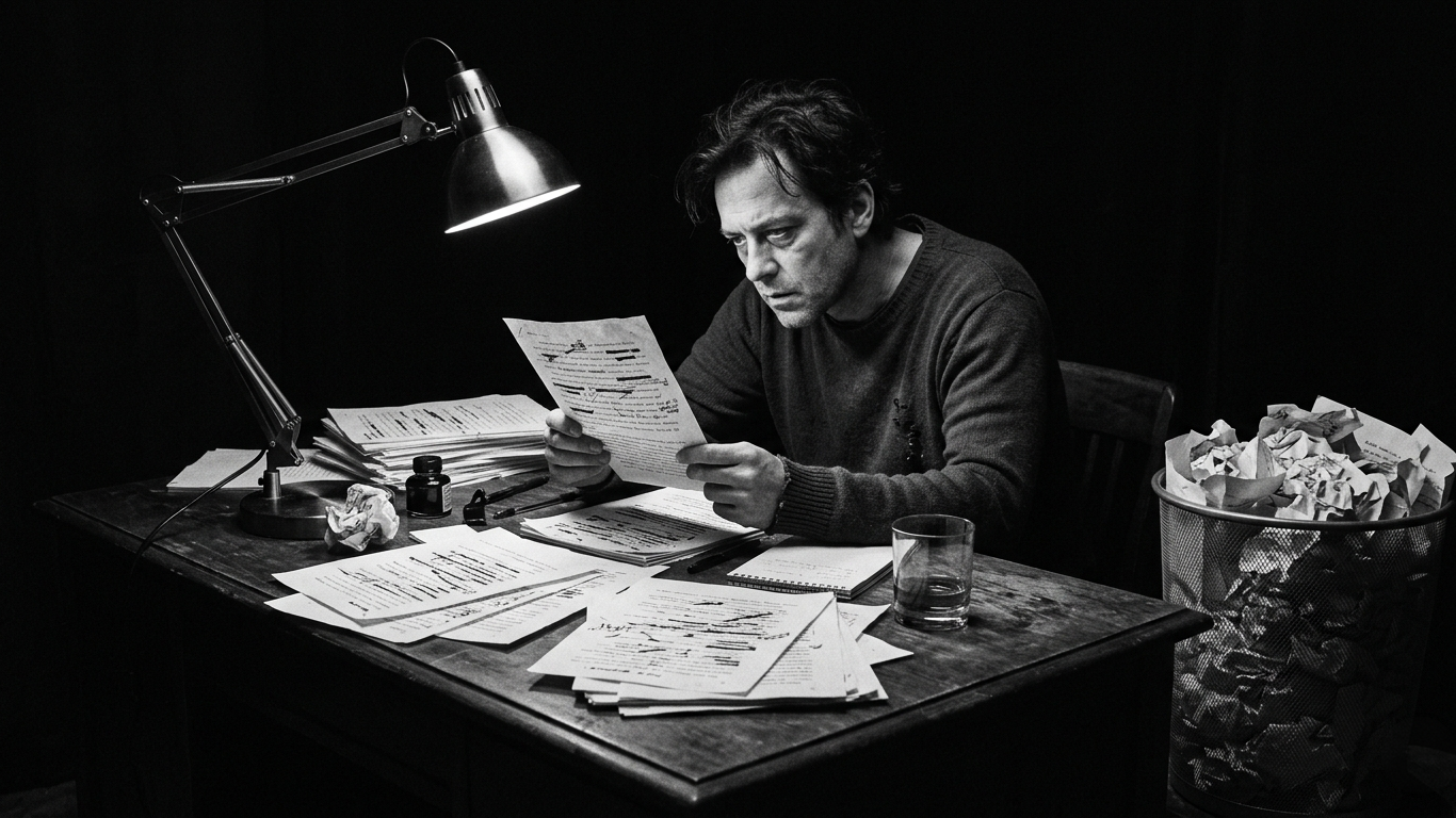
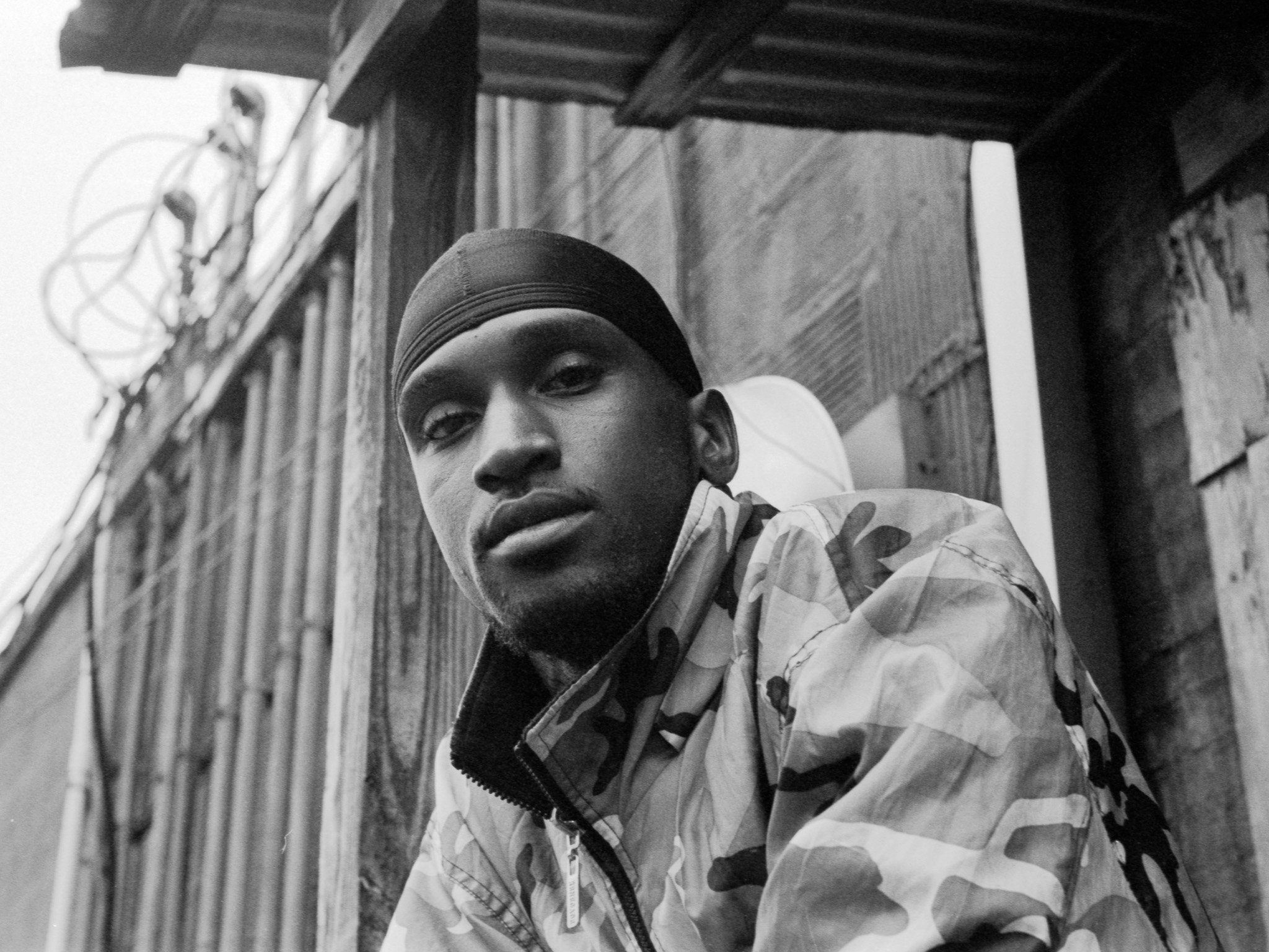
Think about a portrait. The brightest areas are the catchlights and the highlights on the skin. The darkest areas are the deep shadows in the hair or the background corners. Neither of those is where you look when you look at a portrait. You look at the face. The expression. The texture of the skin and the roundness of the forms. That is almost entirely mid-tone information.
When mid-tone contrast is low everything in that range sits at a similar tonal value. The face looks like a mask. The texture flattens out. The forms lose their roundness and the image loses its sense of a real three dimensional thing existing in real three dimensional space. The highlights can be beautifully placed and the shadows perfectly rendered and the image will still feel flat if the mid-tones have no separation.
What mid-tone contrast actually is
Mid-tone contrast is the degree of tonal separation in the middle range of your histogram. Not the very bright areas and not the very dark ones. The broad band in between where most of the visual information in most photographs actually lives.
Adding separation in this range does something specific and noticeable. Forms start to round out. Textures become visible. Light appears to fall across surfaces rather than illuminate them uniformly. The image acquires a quality that is difficult to name but immediately recognizable. It feels solid. It feels present. It feels like something that existed in three dimensions before it was photographed rather than something that was produced on a flat plane.
The technical move is straightforward. In Lightroom or Capture One apply a gentle S-curve targeted specifically at the mid-tone range. A slight lift in the upper mid-tones and a slight pull in the lower mid-tones. Not aggressive. Not the kind of contrast boost that blows out highlights and crushes shadows. A subtle reshaping of the middle of the curve that adds separation exactly where the eye is spending most of its time.
The key word is targeted. A global contrast slider affects the entire tonal range including the highlights and shadows you have already carefully placed. A mid-tone specific curve adjustment leaves those anchors alone and works only in the range that needs attention. These are different tools producing different results and the difference in the final image is significant.
Why film looked different
Part of the reason film photographs have a quality of depth that digital images often lack comes down to how the two mediums handle mid-tones. Film response is not linear. It compresses gently in the highlights and shadows and responds more gradually through the mid-tones in a way that creates natural micro-contrast in exactly the tonal range where the eye is most sensitive. You did not have to do anything to get it. The film did it for you.
Digital sensors are more linear. That is technically more accurate and in many situations more useful. But it does not produce the same quality of depth in the mid-tones automatically. You have to put it back in during editing. Understanding this is useful because it tells you what you are actually trying to do when you reach for the curves panel. You are not trying to make the image look like film necessarily. You are trying to give the mid-tones the same quality of separation and presence that film produced as a natural consequence of how it worked.
How to start
The next time you edit a black and white image try this. Do your normal edit. Set your whites and blacks. Manage the highlights and shadows. Get the image to a place you are reasonably happy with. Then look at it and ask whether the forms in the mid-range have genuine separation or whether they are sitting in a flat band of similar tonal values.
If the answer is flat, open your curves panel and apply a gentle S specifically to the mid-tone range. Lift the upper portion slightly. Pull the lower portion slightly. Watch what happens to the texture and the forms in the heart of the image.
It will not fix an image that has nothing going for it. But in an image that already has something the difference can be striking. The photograph stops being a record and starts being a place. The viewer stops looking at it and starts looking into it.
That is what depth does. And that is how you build it deliberately rather than hoping it shows up on its own.
Ready to see the world differently? The Monochrome Method is a complete video course with lessons and assignments designed to help you craft compelling black and white images and build a portfolio that's unmistakably yours. Start Learning Today.
IF YOU WOULD LIKE TO IMPROVE YOUR BLACK AND WHITE PHOTOGRAPHY TRY THE LESSONS BELOW.


A Beginners Guide To Black And White Photography